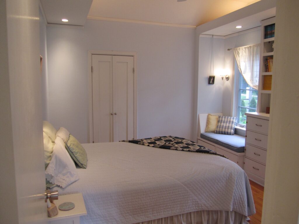
When my wife was expecting our second son, I turned my remodeling do-it-yourself muscle towards an unused room occupying our former attached garage. Hastily turned into an extra room by previous owners, the space was all but unusable and served as a storage room while we remodeled the rest of the house. Now, with our family growing, we needed the room.
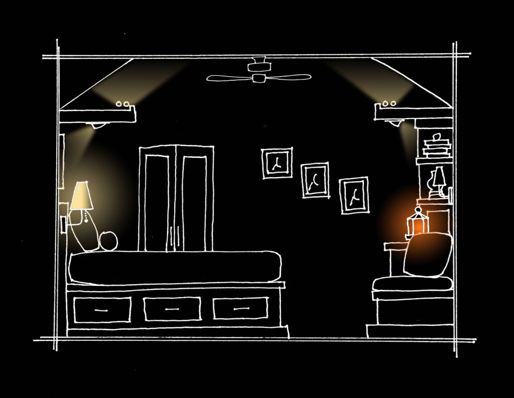
I put together a floor plan for a tiny master suite with closet, bath, and bedroom and scheduled a week off from work to start framing in new walls and a new ceiling. An uncle passed me his copy of The Not So Big House, and the night before construction began I re-drafted the bedroom and included varied ceiling heights, built-in windowseats and storage, and visual weight with an accent wall. I also designed multiple layers of light for the bedroom.
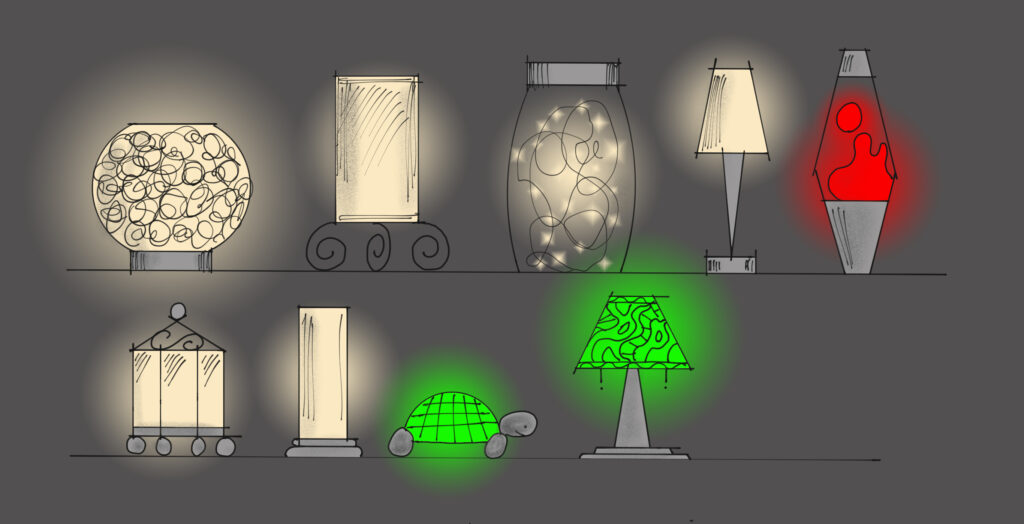
While I did not have words for the theories and concepts I now use, looking back at the room it is clear that I included light for doing, light for knowing, and light for feeling. I also had a dynamic control system (light that changes) and a unified aesthetic that told a much better visual story than my previous plan. And, when candles were lit, I had all four types of light for feeling good: light that burns, light that bubbles, light that sparkles, and light that reveals.

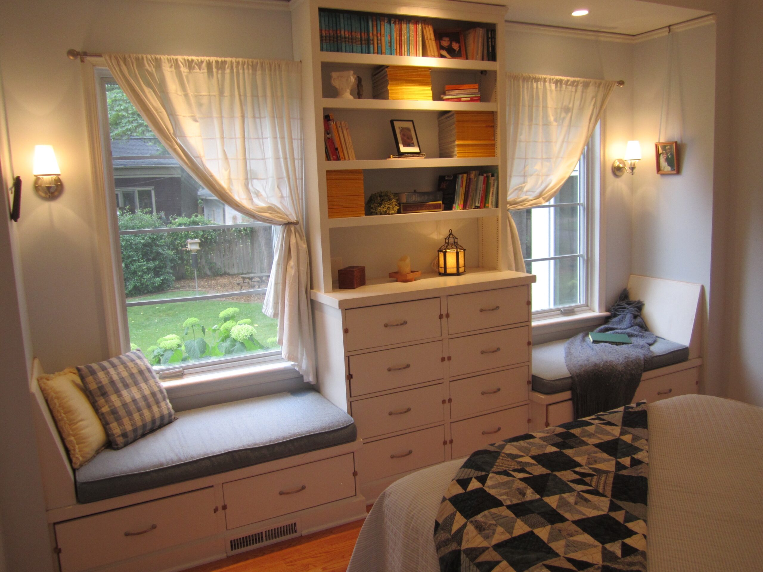
Light that burns was easily included with a few candles on the dresser, which also was home to a retrofit patio lantern that projected patterns of light onto the ceiling- our light that bubbles. The lantern lost its place on our outdoor dining table to an umbrella, so the quick addition of a cord and base turned it into a reliable source of light for the room. Often, just this one light was enough for us to walk through to the closet and bathroom, much more comfortable and inviting than the typical harsh bright light from a ceiling fan.
Two wall sconces provided light that sparkles above the windowseats. Their frosted glass shades were easy to wipe clean, and just the right amount of light could be delivered by the dimming system.

Several layers of light that reveal were added, including spotlights on built-in bookshelves and artwork above the bed. Two different layers revealed the sloped ceiling and soffits above, one in white and one in blue for nighttime use, both of which also provided light for knowing where we were in the space. Rounding out the lighting were a few recessed downlights to provide useable light on the windowseats and in the darkened corners of the room.
Creating a tiny bedroom with 13 light sources may seem extravagant- and in some ways you would be correct. But keep in mind that a typical bedroom will have four bulbs on a ceiling fan and two bedside table lamps- already six sources and the room is not well lit. I landed a 6-dimmer control system from a manufacturer, which allowed me to control the “zones” of light and create programmed “scenes” for easy recall. As a result, getting just the right balance was easy to do, and that made the light for feeling good work its best.

