Sometimes I get questions that seem simple but are complex to answer. A recent Houzz reader asked me “what spacing should I use for my recessed downlights?” Yep, this post is definitely on the practical side.
Hmm. A lot of “designers” have rules of thumb for spacing downlights- perhaps you need one for every so many square feet, they should always be placed on six foot centers, etc.
But asking me for a downlight spacing is like calling up Zappos and asking them to send you the pair of shoes you need without telling them your size or what kind of shoes you want. You could end up with size 12 running shoes or size 7 high heels. The same is true in downlighting…they are not all created equal.
I pondered the question before I realized why it was hard to answer: I don’t have a rule of thumb. I have a rule of light: put the right kind of light in the right place. When you go with strict geometry, you get this:
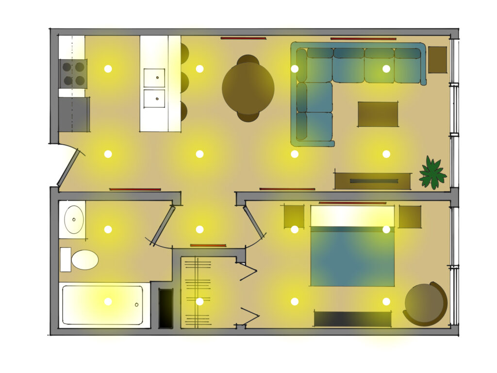
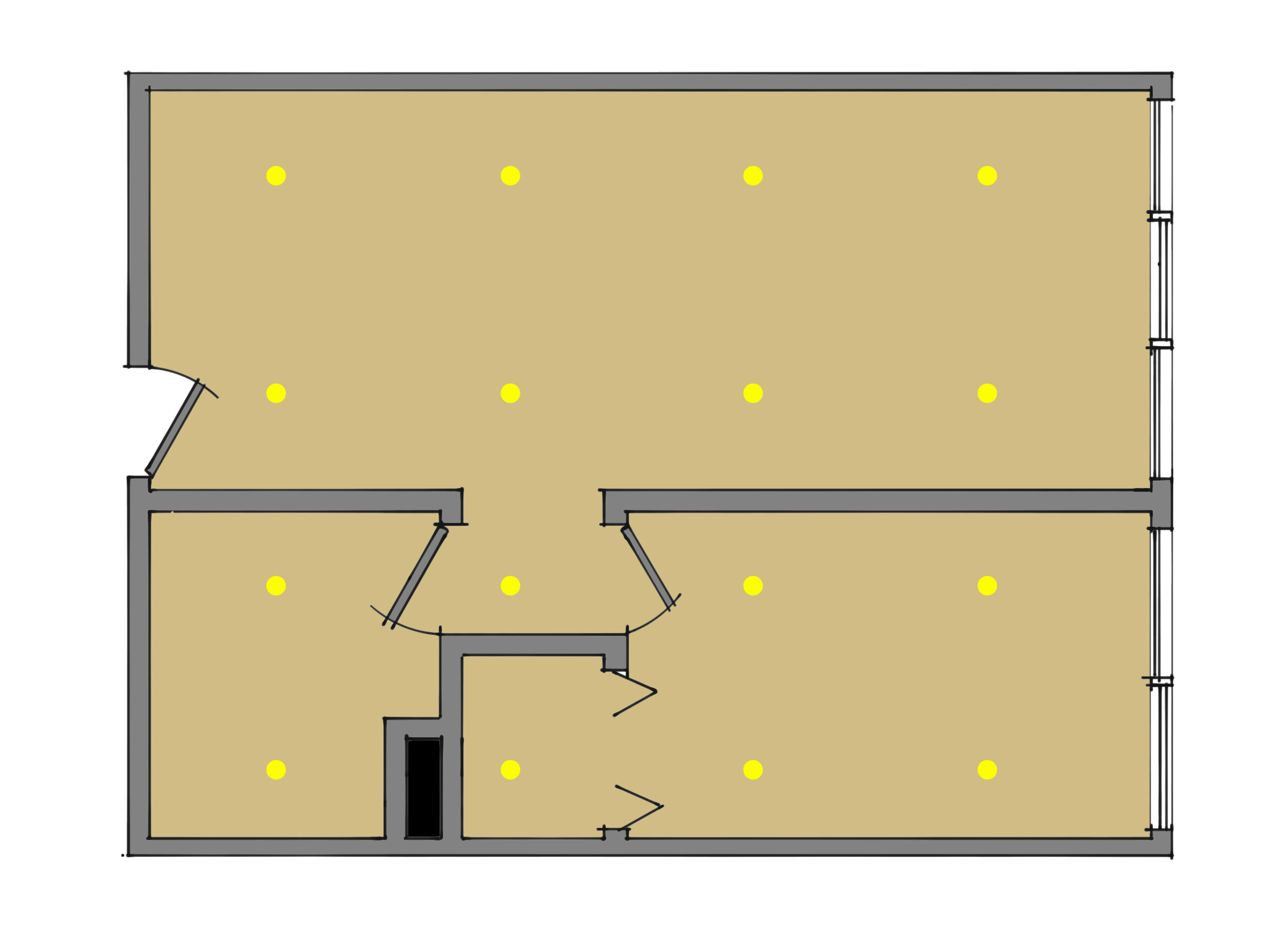
That’s a nicely spaced ceiling, eh? Easy to lay out, easy to install, looks very geometric and seems to more or less cover the entire home. But take note that every counter in the kitchen will be in shadow when you are standing there, light at the bathroom mirror is behind your head, the dining table is in the dark, one side of the bed is brighter than the other, art is in the dark, and there is a spotlight on the front of the television.
Oops.
Let’s start over. Let’s go back to the plan and mark out where we need light: on the artwork, on the counters, on tables, in favorite reading spots, on the pillow at night.
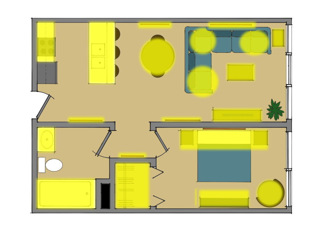
Once we have something like the sketch above, we’re just about there. That’s the hard part! But there is one more step before we figure out the downlight spacing. For me, downlights are only one of several sources needed to make a space function and feel right. So we’ll start by placing under-cabinet lighting, pendants over the island and bar, reading lamps next to the couch and bed, sconces over the mirror, and surface mount lights in the closet.
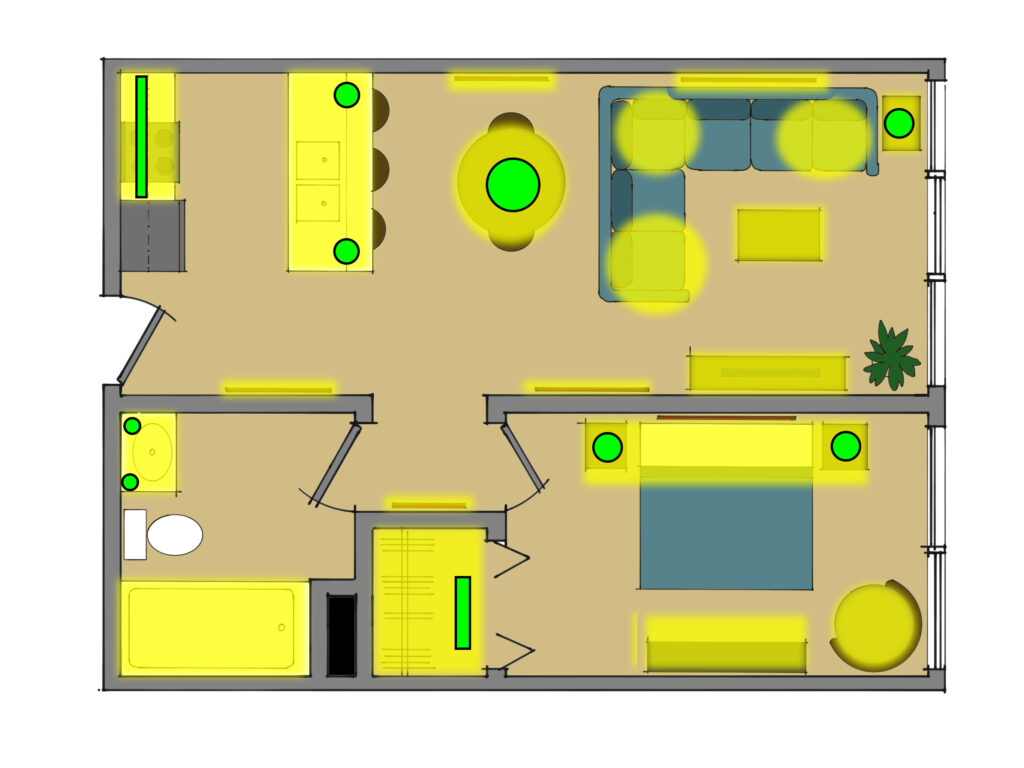
NOW we are ready to look at downlights. See those yellow areas above without a light fixture? It’s like fill-in-the-blanks…need light, place light.
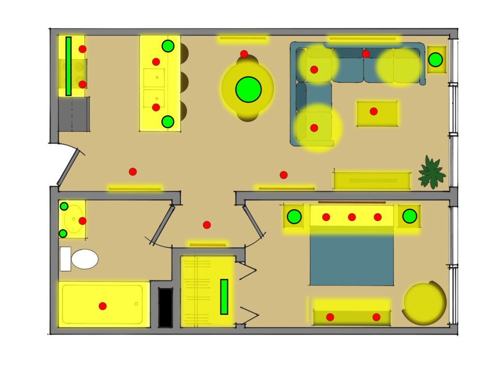
Now we have it. There are recessed (adjustable, of course) lights at walls likely to house art. There are recessed downlights over pillows and the dresser and the sink and stove. Sure, there will be some darker areas of the home, like in the middle of the bathroom floor, but that will actually help the space rather than hurt it. I can’t tell you how many kitchens I have seen where the floor is brighter than the countertop. But hey, the downlights above have the recommended spacing, I’ll bet!
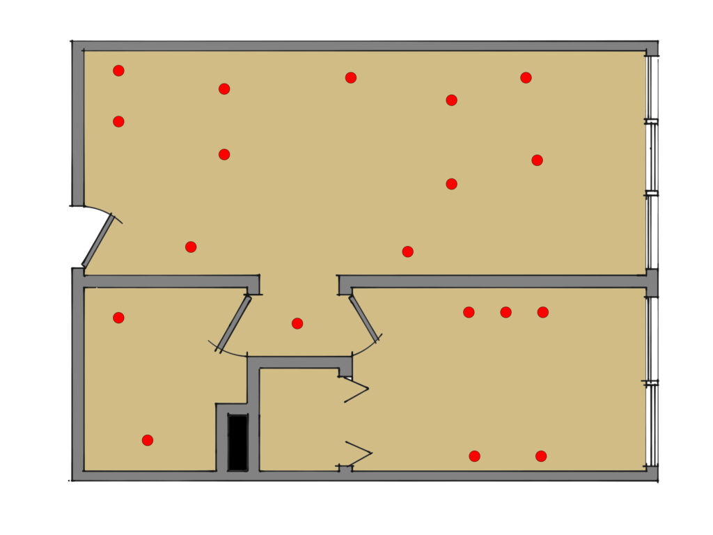
So this is what your ceiling plan for recessed lighting will look like when you’re done. What’s the answer to the question? My rule of thumb for downlight spacing: Infinity times infinity.
Times infinity.
