Tonight we are going to a nearby restaurant for the first time, a local Italian spot with a reputation for meatballs. We will be evaluating the food to be certain, but also evaluating the atmosphere. Is it a place we would enjoy again? Would we bring friends or out-of-town family here?
Our decision will likely be influenced by lighting, even if only in our subconscious. What makes dinner awesome is the food and the people we share it with, but our surroundings can push an experience up or down. And our surroundings are only visible with light.
If you could choose a restaurant to design into your home, what would it be? A dark and romantic fine dining restaurant? A warm and relaxing gastro-pub? A bright and vibrant pizza joint? Why not all the above? A well-illuminated dining room can serve you and your family and friends for every meal from a quick breakfast to a leisurely dinner.
Part of the fun of blogging my way through my new Don’t/Do This series is trying new things. I started with numbered lists that became increasingly exhaustive. I added executive summaries to shorten the commitment from readers. I tried sketching multiple styles from modern to traditional. Today I branch out again and will try a couple of different approaches, and I would love for you to share which works best.
STYLE 1: ZONES & PROMISES
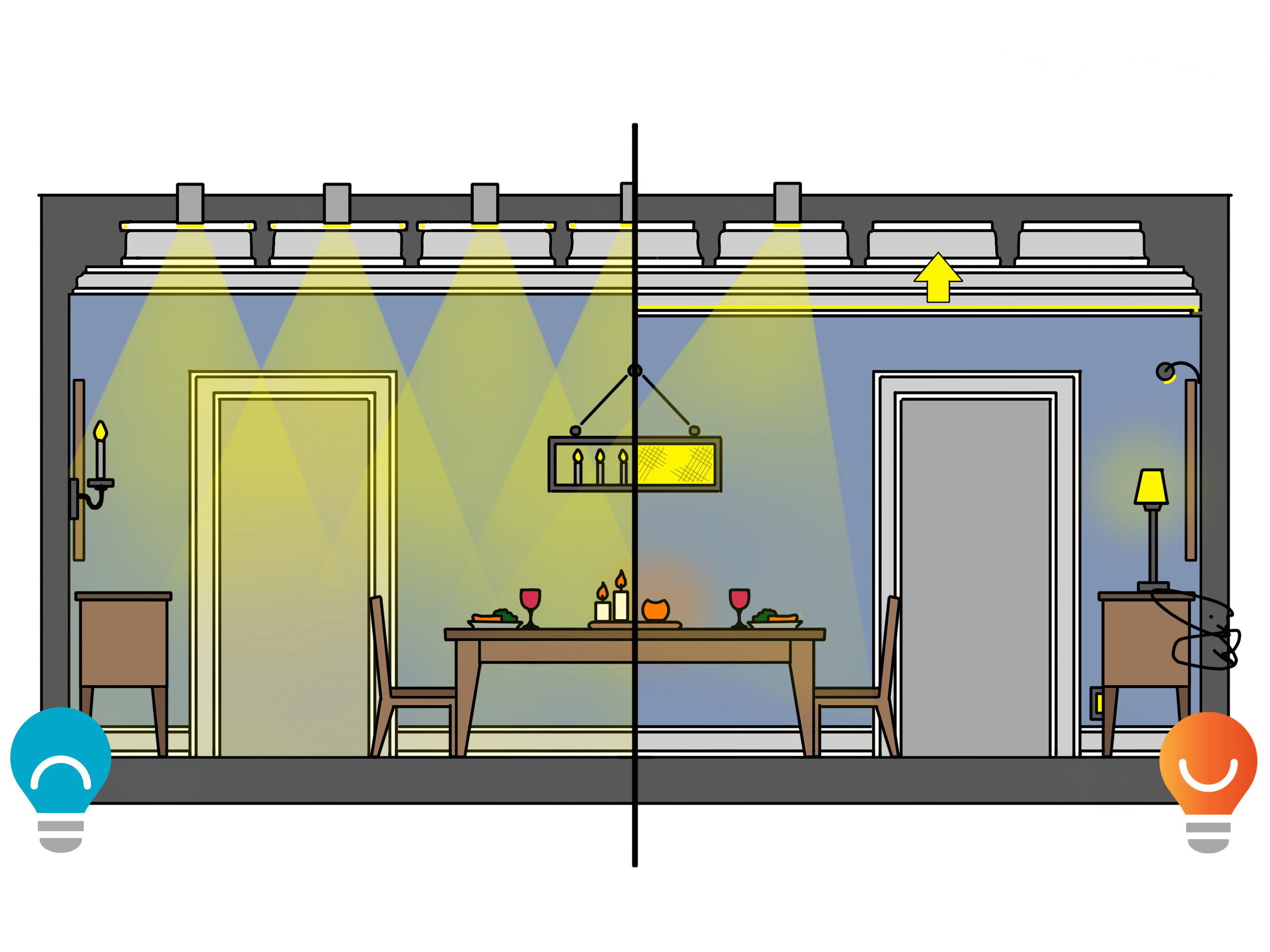
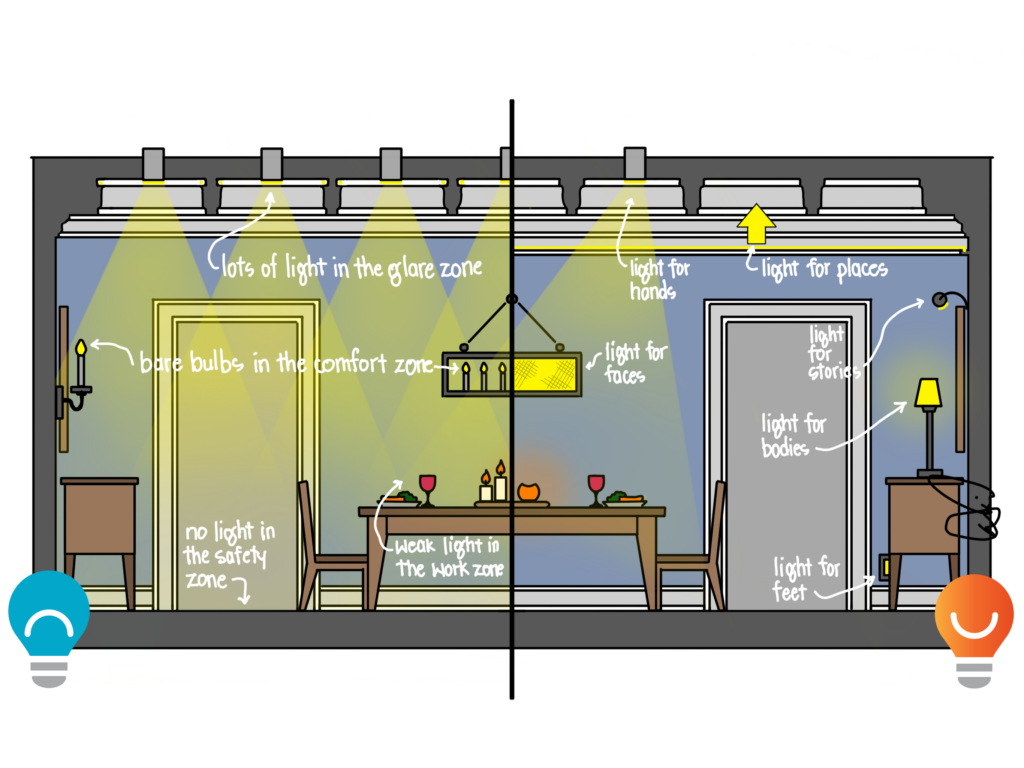
Interwoven with my Don’t/Do This series this year is a series of posts exploring the core language of light and design philosophies I use to design lighting for homes, my Light Can Help Us series. In it I explore different ways to categorize light in terms of the promises that great lighting can deliver, and this has exploration has given rise to some new thinking on zones of light. In this first example of dining room lighting, I’ll use my thoughts from those posts to describe the good and bad.
Don’t Do This
- Beware of Glare. We have a Glare Zone in our field of vision directly above us, a place where bright downlights, disc lights, or other fixtures can cause the most discomfort. Our eyes are sunken back under a brow to help prevent that light from reaching us, but indoors it is all too easy to pack the glare zone with lights that hurt us. Avoid grids of recessed downlights pointing at the floor in a dining room; the glare they produce will detract from your experience.
- Cover for Comfort. All around us, where our eyes naturally rest, is a place I am calling the Comfort Zone. You might find windows here, and we can benefit from the same soft light delivered via electricity after dark or in darker corners of the room. The key is that light here needs to be soft and diffuse, or very, very dim. Bare bulbs and very narrow strips of light found in many modern chandeliers violate this rule if used to deliver practical light. They will cause discomfort instead of comfort. Here’s a test you can use to determine whether your dining room suffers from a poorly illuminated Comfort Zone: turn your lights on as you normally would, then stare at each fixture. If it hurts to stare at it, or if you see burned-in images of the source when you look away and blink, you have glare. Cover up bare bulbs with shades and choose fixtures with wide diffusers to deliver better light in the Comfort Zone.
- Weak does not Work. Even with our hands is a Work Zone that needs to be strongly illuminated. In a dining room, this zone is usually at the table top where our food and drink live. Too many beautiful chandeliers leave the Work Zone weakly illuminated, often pushing more light up than down. If you turn on all the lights and the table top is not brighter than your ceiling, you have weak light in the Work Zone.
- Sacrificing Safety. Light that helps us see where we are going is delivered down low to an area I call the Safety Zone. When all light is from above us, what reaches the floor will be accidental and potentially weak. Even worse, when used at night, light from above has the potential to be the most disruptive to our sleep. We need light down low to gently yet intentionally illuminate the Safety Zone while keeping light out of our eyes.
Do This
- Light for Faces (Know More). Unless we always dine alone, it can be helpful and comforting to see the faces of our companions. We need light to understand their unspoken emotions and to correctly interpret their spoken words. And it would be nice if the light on their faces was comfortable and kind. This can best be delivered by a chandelier or pendant above the table, but the fixture must emit a very soft, diffuse glow out sideways to the faces of our companions. Sadly, this is rarely the case when style is prioritized over substance.
- Light for Places (Know More). We like to know where we are and what is around us, and that means illuminating the entire room with dim, soft light. One highly effective way to achieve this is with indirect light bounced off the ceiling from a cove or illuminated crown. Light bouncing of walls is also a critical component of light for places- and it can deliver on other promises, too.
- Light for Hands (Do Better). We need good, strong light for our hands to see what we are doing so we can do it better. In a dining room, the brightest spot should be on the table. If your chandelier is like most, it will make the ceiling brighter than the table. You may need to fill in with carefully placed recessed adjustable fixtures to push light to the tabletop.
- Light for Bodies (Feel Better). Daylight- and plenty of it- is the best kind of light for our bodies that will help us feel more alert during the day and even helps us sleep better at night. Light for our bodies comes from all around us but is especially important from directly ahead and above, like windows and skylights. After dark, lighting around the perimeter of the room, like a hug, wraps us in comfort that works for our bodies and our minds. Decorative lamps with soft shades, wall washing, art lighting, and a soft glow on the ceiling all deliver light for our bodies.
- Light for Feet (Know More). Down near the floor, in our Safety Zone, is an opportunity to deliver light that helps us know where we are going without adding unwanted evening lumens to our eyes. Step lights, toe kicks, and light under floating cabinets all deliver light to our feet and can make a space surprisingly comfortable and welcoming. Most of our clients have never tried this before and are quite skeptical; those that move ahead with light for their feet end up loving it.
- Light for Stories. When all the layers of light are in place, the end result is light that helps tell our stories and reveal what we value. Light on art or photographs helps tell our stories while also delivering soft light to our bodies. Dimly illuminated chandeliers can help reveal our style. Spotlights on furnishings or plants add depth to our space. When you get it all done right, the story you tell will be one people want to read again and again.
STYLE 2: PAINT BY NUMBERS
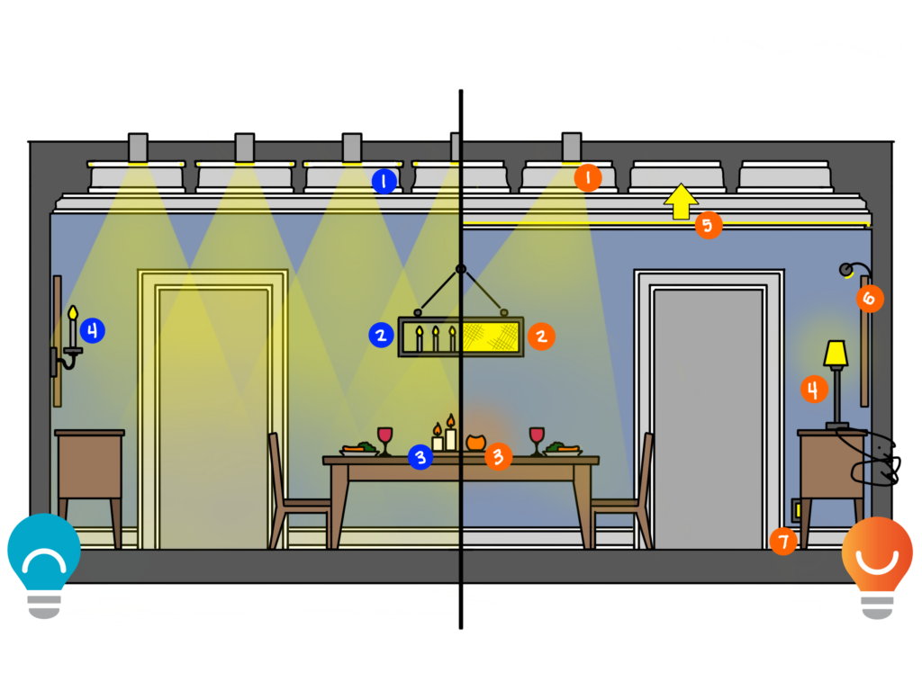
Now let’s try the same thing in a different way. Instead of Promises and Zones, take a look at the same dining room with item-by-item descriptions of what to avoid and what to add. Then let me know which method you found to be easier to read, or more engaging, or more useful.
Don’t Do This
- Downlight Grids. A tidy grid of recessed downlights will illuminate the room like a Walmart: efficiently but without comfort. These lights will often cause unconscious glare that adds to eyestrain and fatigue, so use downlights sparingly.
- Trendy or Traditional Chandeliers. Chandeliers based on centuries-old lighting technology like candles will deliver more light to the ceiling than the table and trendy sleek modern chandeliers try to push light out of tiny or narrow strips that cause discomfort glare. They may look good in the catalog (during the day) or in the showroom (when surrounded by a hundred others), but on their own at home is not a good idea.
- Candles on the Table. Okay, this one could be a bit contentious. I like candles on the table, and lots of them, but bare candles in a darker dining room can result in little flames of glare in your eyes. Be careful.
- Ensconced Glare. Decorative wall sconces can be part of a very comfortable dining room, but anything with a bare bulb is bound to cause more glare than comfort.
Do This
- Focus on Food. Use carefully placed recessed adjustable (aimable) downlights to push light to the table, making it the brightest place in the room while keeping chandeliers dimmed. This will create balance that makes everything better.
- Be Gentle on Faces. Softly illuminated faces of companions are comforting and useful for conversation. Chandeliers that hide the light sources and spread the light out over soft shades and diffusers can improve the dining experience.
- Cover the Candles. One of my favorite restaurants growing up was a little local Italian restaurant that had red glass globes on each table with a candle inside. The restaurant has been closed for twenty years but I still remember them; covering candles with a glass holder softens the light and deepens the memories.
- Light the Lamp. Lamps are the easy button when it comes to better lighting. A soft linen shade covers the bulb and diffuses the light, sending strong light downwards and secondary light upwards. The effect is very comforting and adding a few lamps to a sideboard or small table around the perimeter adds to the lighting hug.
- Reveal Details. I cannot tell you how many beautiful, coffered ceilings are peppered with recessed downlights and completely lacking in cove light. Every time the sun goes down, to properly see the beautiful ceiling, you have to look straight into the glare of all these downlights. Instead, surround the room with a tiny cove to cover the ceiling in a soft warm glow. The ceiling will look better, the room will feel more comfortable, and somehow the food will taste better.
- Focus on Art. If you have art you love, put some light on it. If you have art or photos that you put up just to have something on the walls, light it anyway. The resulting brightness in our near field of vision will help you feel better, and the soft light bouncing off the wall will even make the rest of the room look better.
- Add Light down Low. Like a lovely garden with a gently illuminated path, your home can be comfortable to traverse at night without glare from above. Light down low from steplights, floating cabinets, or toe kick will likely become your favorite light in the house.
Whew, that was intense. Which style do you prefer? Zones & Promises or Paint by Numbers? What happens when we put them together….
STYLE 3: ALL TOGETHER
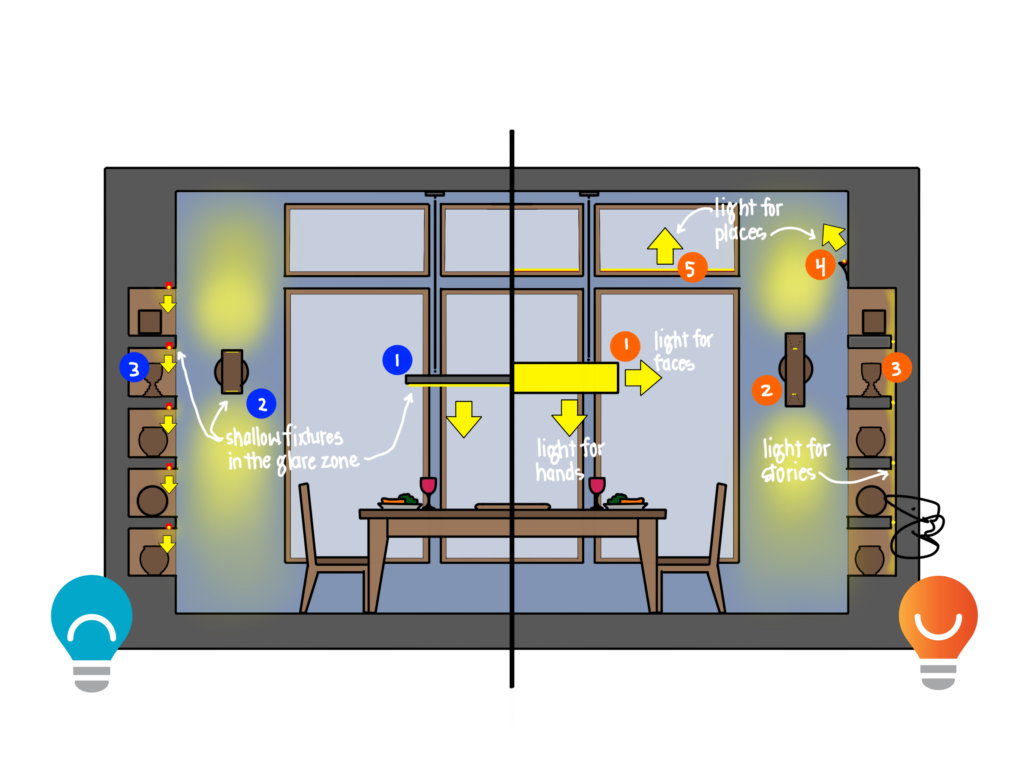
Let’s take a look at a modern version of the dining room featuring large windows and built-in display shelves.
Don’t Do This:
- Beware of Glare: Shelving. Illuminated shelves are a great way to add beauty and comfort to a room, but downlighting the shelves is not a great idea when the shelves are above eye-level. One of the best house rules for lighting is to point the light away from your eyes.
- Beware of Glare: Sconces. Some sconces create obvious glare, but what about sleek contemporary cylinders? Not all sconces deliver light in the same way, even when they are the same shape. In this example, the light source is near the top and bottom of the sconce, instead of recessed inside, which increases the likelihood of discomfort glare.
- Beware of Glare: Pendants. Little thin linear pendants are all the rage…and kind of fill me with rage, too. They are absolutely beautiful and stylish when they are off, and often do a decent job of illuminating the table, but they don’t do a very good job of softening the light due to their diminutive size. If they are above eye level, you’ll see a painfully bright stripe of light.
Do This:
- Be Gentle on Faces. Soft illumination that comes out of the sides of a larger linear fixture will put a comfortable and comforting glow on the faces of your companions.
- Beware of Glare. Wall sconces that do a better job concealing the source of the light, like deep recesses in this cylinder sconce, will reduce glare and add pleasing light to a space.
- Light for Stories. What is most important in the dining room – displaying a specific collection or creating a specific mood? If collections are of primary importance, consider shelf lighting that puts the best light on the objects. If mood is more important, consider backlighting the shelves and silhouetting the objects for a dramatic beautiful look.
- Light for Places. Simple details can add coves to otherwise plain rooms, revealing the space and adding a layer of soft diffuse light that makes everything look and feel better.
- Light for Places. Tall windows often create opportunities for indirect linear light to conceptually replace some of the daylight lost after sunset. Look for convenient, flat places where linear LEDs can be concealed to bounce light into the room.
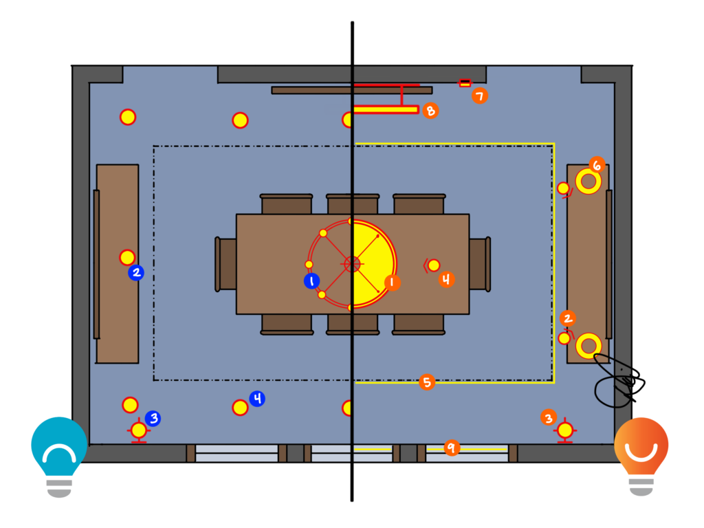
A Better Plan
As I look at the plan above, I’m a little dumbfounded that I put nine different ideas in one dining room. Would I really do that? Yes, in a very beautiful dining room where comfort and quality outweighed the expense. In a smaller space with a tighter budget I might drop a few things, like the recessed lights over the buffet and the indirect in the windows, but I would still recommend multiple layers of light. If you want all the promises of light, you can’t get them from a chandelier.
Don’t Do This:
- Trendy or Traditional Chandeliers. Avoid bare bulbs whenever possible. Those open chandeliers needed bare candles to deliver light, but the thousand-times-brighter electric bulbs just add glare to a space.
- Ditch the Downlights: Art. There is a recessed downlight near a piece of art here, but it is merely coincidental because of a geometric grid layout. Because the downlight points straight down, it will never put its best light on the art and will add unnecessary glare to the room.
- Be Careful with Sconces. Just like chandeliers, sconces with bare bulbs or visible, small sources will produce unwanted glare. They might be okay if dimmed to nearly off, which is what we often have to do.
- Avoid Grids. “What is the proper spacing for downlights” really means “we don’t know what to do so we want to overwhelm the room with glary light.” A grid of downlights will light the floor well for your dog, but add glare, unwanted scallops, and wasted light to a space. Be strategic.
Do This:
- Be Gentle on Faces. Chandeliers should provide soft diffuse light to the faces of your companions. The larger the shade and more concealed the source, the better. Drum shades with bottom covers are great for this.
- Focus on Art. Recessed adjustable downlights can be aimed at art, photography, built-ins, or wall coverings to reveal beauty and texture. Stop wasting light on the floor and start aiming it where your eyes go.
- Cover the Candles. Wall sconces that conceal the source with shades or deep recesses will be far more comforting than visible bulbs…this is what we need in our comfort zone.
- Focus on Food. Push light to the table with recessed adjustable downlights to ensure the hands at the table have what they need.
- Light for Places. Tray ceilings add beauty to a room, but crowding them with recessed lights will only hurt your eyes when you look up to admire the detail. Add soft, warm linear cove lighting to reveal the detail and fill the room with a comforting glow.
- Light the Lamps. Lamps with soft shades on sideboards or occasional tables add light to our comfort zone while keeping it out of the glare zone. And with this beaing the least expensive layer to add, what’s not to love?
- Light Down Low. Light in the safety zone from steplights keeps glare out of our eyes and makes walking through the home a pleasant experience.
- Focus on Art. No recessed lighting for art? Picture lights come in classic and modern styles and can be a great way to add light into our comfort zone while revealing the beauty of our possessions.
- Light for Places. Indirect light on clerestory windowsills can add light to our comfort zone and replace some of the natural light that went down with the sun.
Put soft light into the room and on faces. Shield your eyes from glare. Call attention to detail and possessions. Get strong light on the table. Add light down low for your path. Great lighting in a dining room is achievable if you look for it.
Read more of my Don’t/Do This posts HERE.
Read more on Dining Rooms HERE.
