A few years ago I wrote a post on the do’s and don’ts of front porch lighting. So why do it again? Because I never stop learning about light, and that means every few years I might make different recommendations. That is certainly true outdoors as I learn more about the negative effects of light at night (LAN).
This time around, I also wanted to think beyond the tidy craftsman bungalow porch in my earlier post and explore different home styles. Going into the exercise, I wondered if my recommendations for different architectural styles would remain the same. In the end the techniques stayed the same but were detailed in slightly different ways. That is because, in the end, lighting our homes is not about style but more about humans. And humans, though incredibly diverse, have eyes that work in about the same way outside a modern home or a classic colonial revival.
This post could get quite long, so I’ll start off with the executive summary (I wonder how many executives actually read them?).
- Don’t use glare bombs. This is perhaps the most common offense outdoors: porch lanterns styled with brass and glass and electric candlesticks. The bare bulbs have a tendency to cause glare and eyestrain…and that’s just the negative effects on the people approaching our house.
- Don’t pollute or trespass. Those same lanterns often send light up into the skies or across the property line into our neighbor’s yard or home. Any light sent upwards past our homes is pollution- wasted energy and money and harmful to our bodies and our planet.
- Don’t light randomly. Throwing light on a house with soffit lights every four feet or landscape spotlights on less-than-attractive features is thoughtless, and looks so.
- Do point it down. Full cutoff fixtures point downwards and shield the light source from glare, limiting pollution and lighting the path.
- Do be selective. Floodlighting everywhere is appropriate for prison yards, not yours. Pick features and edges and let the rest go dark.
- Do light for your feet. Point light down, use path lights and step lights, and make sure the brightest place is where you need it most.
- Do turn it off. When you go to bed, turn off the lights so your neighbors and animal friends can sleep too.
Now let’s look at these rules in a few different scenarios. I chose these styles somewhat randomly out of dozens, in part because they are common and because they are stylistically very different from each other. At the end of the post I have a façade that pulls it all together.
Suburban Dream Home
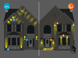
This house borrows from colonial revival but with a distinctly suburban flare. The large entry hall would have a chandelier hanging in the arched window, and gables give the façade visual interest.
Don’t:
- It is best to avoid “brass and glass” coach house lanterns with visible light bulbs. These will shine in your eyes, making it barely possible to see while guaranteeing discomfort.
- It’s time to skip the uplights. I’m guilty of using these on many projects, but stake-mounted landscape spots usually create light pollution and waste. There are better ways.
- Don’t invest in dozens of soffit lights, especially in gable ends where they will shine in your face. This will light the house, but not with any artistry or care.
Do:
- Choose sconces that point downwards. They may not be as “historically appropriate” as the coach house lantern, but neither is the air conditioner or refrigerator or two car garage.
- If you put lights in the soffits, try lighting only the corners of the house. Lighting the edges will help you comprehend the entire home without blasting it with light.
- Focus on the details. Most homes have some kind of exterior feature, and that is a great place to start when choosing what to light. In this case, the bumpout makes the façade more interesting – and can continue to do so after sunset if properly illuminated.
- Light the places you are most likely to trip. Linear lighting embedded into steps is a great way to improve safety without adding glare or waste to the home.
Modern Farmhouse
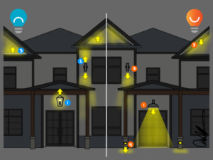
Variations of the farmhouse style – think white walls, black windows, and standing-seam metal roofs – are extremely popular in many parts of the country. This style particularly lends itself to good lighting, but it is just as easy to get it wrong.
Don’t:
- Hanging lantern-style pendants are an attractive stylistic move, but most put their best light up on the ceiling and their worst light down where you need it.
- These staples of mid-century design can be used on nearly every style home, but the uplight portion is likely to cause light pollution and waste.
- Uplighting the gables is a unique technique most often seen on Classical Revival government buildings, and is usually going to cause light pollution and waste just like any uplighting source.
Do:
- The modern farmhouse begs for updated “barn lights,” or RLM shaded fixtures, that have a hood to block out all uplight. Light then calls attention to the building or the sidewalk and not itself. This happens to be one of my all-time favorite fixtures.
- Up/down cylinder fixtures can be improved by removing the top bulb, or purchased without an uplight component. The results are better for the occupants, neighbors, and planet.
- Linear light can be a pretty cool technique, and it does not have to point up. Tucking it behind fascia shields the source from view and calls attention to the gable detail.
- Steplights are most often seen in movie theaters, but we use them by the bucketload anywhere you want to walk at night.
Contemporary
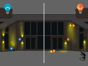
This signature style of the 1970’s and early 1980’s features simple facades, large sloping roofs, solid wood-covered walls on the front and large expanses of glass on the back. The up/down cylinder practically defines the lighting style for these homes, but is that the best choice today?
Don’t:
- Cylinders or rectangular versions are perfectly styled for contemporary and modern homes, but skip the uplight component to protect the planet and our dark skies.
- Uplighting, especially on blank wall sections, may not be the best approach to outdoor lighting. It is easy to do, but sends money and light into space…where no one needs it.
Do:
- Use lights that are shielded and point light down, like cylinders. If you can see the light bulb or source, it is not shielded enough.
- Steplights work on any style of home but are particularly suited to modern and contemporary styles.
- Instead of uplighting, consider spotlights or recessed lights in soffits that point light downwards. Stay away from paths to minimize glare.
Southwest
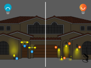
When I travel to Tucson or Las Vegas, adobe-style homes with red clay tile roofs abound. Arched windows and doors round out the southwest style.
Don’t:
- If a light fixture puts a lot of light out sideways, it will cause uncomfortable glare.
- Coach house lanterns are, at first glance, appropriate for garages that serve as our modern day coach houses. But sideways light is like headlights from oncoming cars: bright, but not helpful.
- No matter the style, uplighting is problematic.
Do:
- Full cutoff fixtures come in many styles but always shield the light source, reducing glare and waste while directing more light where you need it for your feet.
- These same cutoff fixtures, like barn lights, can illuminate the driveway better than any lantern.
- Try using cylinder wall sconces with downward-facing light to illuminate walls and features. Concerned about the aesthetics? Many fixtures can be spray-painted to blend into the house and all but disappear during the day.
- Steplights are a building-mounted version of garden path lights and perform the same function: adding light for your feet to make traversing the night safe and comfortable.
Classical Revival
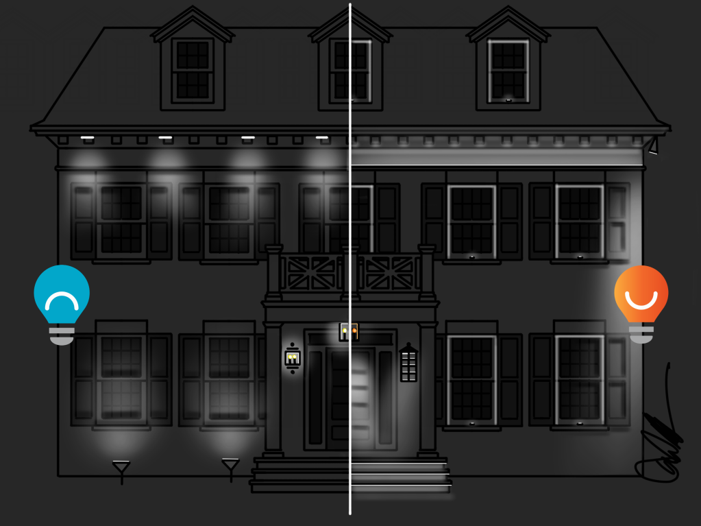
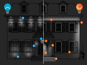
Now it’s time for the final exam to see if I was successful in laying out some ground rules for exterior lighting on the front of the home. This classic Greek revival borrows elements from colonial revival and is distinctly American. Painted all white with gray shutters and a dark roof, with double-hung divided-lite windows, this elegant home begs for elegant lighting.
Don’t
- Why might this homeowner avoid a bright brass and glass pendant over the door? Hint: check out Executive Summary #1.
- You probably already know why the brass and glass coach house lantern is uncomfortable and unhelpful. Also keep in mind size and scale: it is easy to purchase a fixture that looks good in the store but ends up being too small for the house.
- For reasons not to uplight homes, check out Executive Summary #2. And here is one more: the uplighting shown here will shine into your home, potentially disrupting your sleep.
- Number 3 in the Executive Summary above outlines why indiscriminate lighting, like these soffit lights not aligned with the windows or architecture, leave a lot to be desired.
Do:
- When the brass and glass pendant is a given, put it on a dimmer and use it to make the glow more like a candle and less like a 40-watt blinder.
- Check out Executive Summary #4 if you cannot recall why sconces that push light downwards are better for your feet and the planet.
- A recessed adjustable downlight aimed at the front door, at a steep angle to minimize glare, highlights the most important place on the outside: the place you get inside.
- Linear at the steps is great…check out Executive Summary #6 for why.
- Finding the edges, like these corner spotlights, is one way of being selective with your lighting as discussed in Executive Summary #5.
- Uplighting this beautiful frieze level and dental molding seems stylistically appropriate, but only when light will be caught by the overhang and turned off as discussed in Executive Summary #7.
- Finally, put a candle in the window for your guests. A few centuries ago that single candle, in a world without light pollution, could be seen for miles and would help guide your visitors. Now the GPS in our phones will do the hard work, but the comfort and welcome from an illuminated home can still be inviting. Windowsill lights are a modern approach to the candle in the window effect and are dedicated specialized fixtures that put a glow around the inside of the window frame. Lighting can be fun and surprising, and these unique fixtures are part of the reason why.
Overwhelmed? Skip the stuff in the middle and revisit the executive summary at the beginning of the post. Then point the light down, be choosy in what you light, make sure your feet have light, and turn it all off when you go to bed. The end results will be more functional, comfortable, inviting, and beautiful.
Read more of my Don’t/Do This posts HERE.
Read more about front porch lanterns HERE.
Need a way to improve your front porch without an electrician? Read THIS.
