This post is a continuation of my Don’t/Do This: Primary Bedroom exploration.
My Don’t/Do This series are a lot of fun to sketch and imagine. Too much fun, perhaps, as the post on primary bedrooms has now ballooned into three. Without much forethought, I find myself creating an increasingly comprehensive series aimed at comparing and contrasting what to do for good lighting- and what to avoid.
In other words, this post may have been fun to sketch but it likely to be very un-fun to read. I recommend it only for those trying to determine how to light a modern bedroom. Or those who enjoy reading technical manuals.
Lighting is not just about getting it right, it is also about avoiding getting light wrong. Sometimes, the difference is a 1/4″ of trim that blocks tape light, or a decorative pendant forced to deliver useable light to a kitchen counter. Some solutions are perfect for traditional homes while others look out of place anywhere but the most modern spaces. To that end, here’s a look at primary bedrooms with more modern style. For a more comprehensive introduction, check out the first primary bedroom post.
This time around, let’s try something new. Instead of providing an executive summary followed by a number-by-number description of each lighting choice, I’ll see if I can combine it all. Simpler may be better?
- Keep it dark. The first rule of sleeping is that we do it better in the darkness. This means blocking out light at night using blackout shades, keeping exterior lighting to a minimum, and ideally raising those shades automatically to ease your waking.
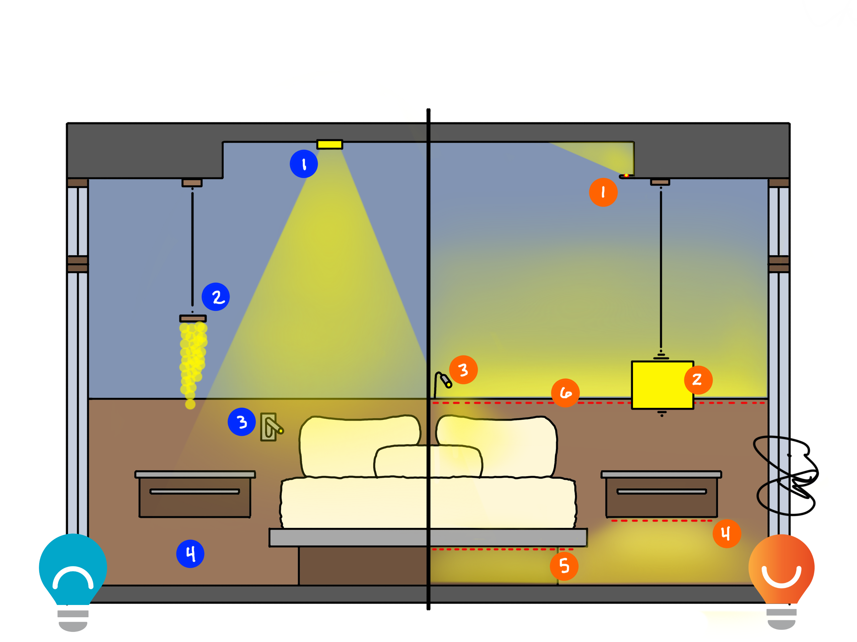
- Light the walls. Our “comfort zone” is what we see in front of us, and that should be softly illuminated. In the example above, DO #6 illustrates light tucked behind a an architectural reveal. This accentuates the architecture, sets the bed apart from the rest of the room, adds soft light to the ceiling, and adds a pleasant glow to the walls.
- Glow the ceiling. Indirect light, when used as a soft component of a layered strategy, can make our spaces feel larger and more comfortable. DO #6 will add light to the ceiling, as will the cove light identified as DO #1. Even a good bedside lamp (DO #2) can add light to the ceiling.
- Watch your step. Lights down low put light where we need it and keep light out of our eyes for less disturbed sleep. DO #4 and DO #5 can make the furniture appear to “float” and will be very comforting. In DON’T #4, the floor is only lit from above, which can lead to poorer sleep.
- Respect your partner. Reading in bed while your partner sleeps can be very relaxing- for one of you. Bedside ready spotlights can help, but when pointed towards your partner (DON’T #3), they will inevitably spill light where it is not wanted. Try center-mounting the fixtures instead, as shown in DO #3, and point the light away from your partner.
- Ditch the downlights. DON’T #1 Recessed downlights in tidy grids are like the 2×4 fluorescent troffer fixture of the home- ubiquitous, functional, but not very comfortable or beautiful. There are caudally better ways to get light into the room – all the layers in DO negate the need for recessed downlights in this view.
- Point it away. This is quickly becoming my favorite rule of lighting design. Point it towards your eyes and you get glare. Point it away and you get comfort. DO #1 and #6 point towards the ceiling; DO #4 and #5 point towards the floor.
- Keep it soft. Here’s a new one for this post: bedrooms, like beds, should have a comforting softness to them. Avoid using fixtures with bare bulbs or tiny built in LEDs (DON’T #2) and look for fixtures that conceal the source and spread out the light over larger shades (DO #2).

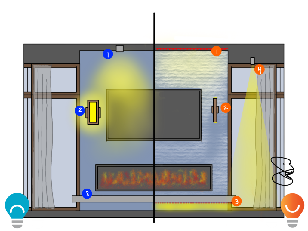
Opposite the bed in this modern example we find tall windows, a textured stone fireplace and a stone fireplace.
Light the walls. This can be seen in the grazing light on the fireplace, the up/down wall sconce and the curtain-warming light at the perimeter (DO #1, #2 and #4)
Watch your step. Completely dark in DON’T #3, the floating hearth becomes a perfect spot for step lighting in DO #3.
Ditch the downlights. Avoid DON’T #1, a downlight that puts glare on the television, and use other techniques.
Keep it soft. The wall sconce shown in DON’T #2 might be too bright and could make it difficult to see the TV. The discrete sconce in DO #2 will call more attention to the stone than itself.

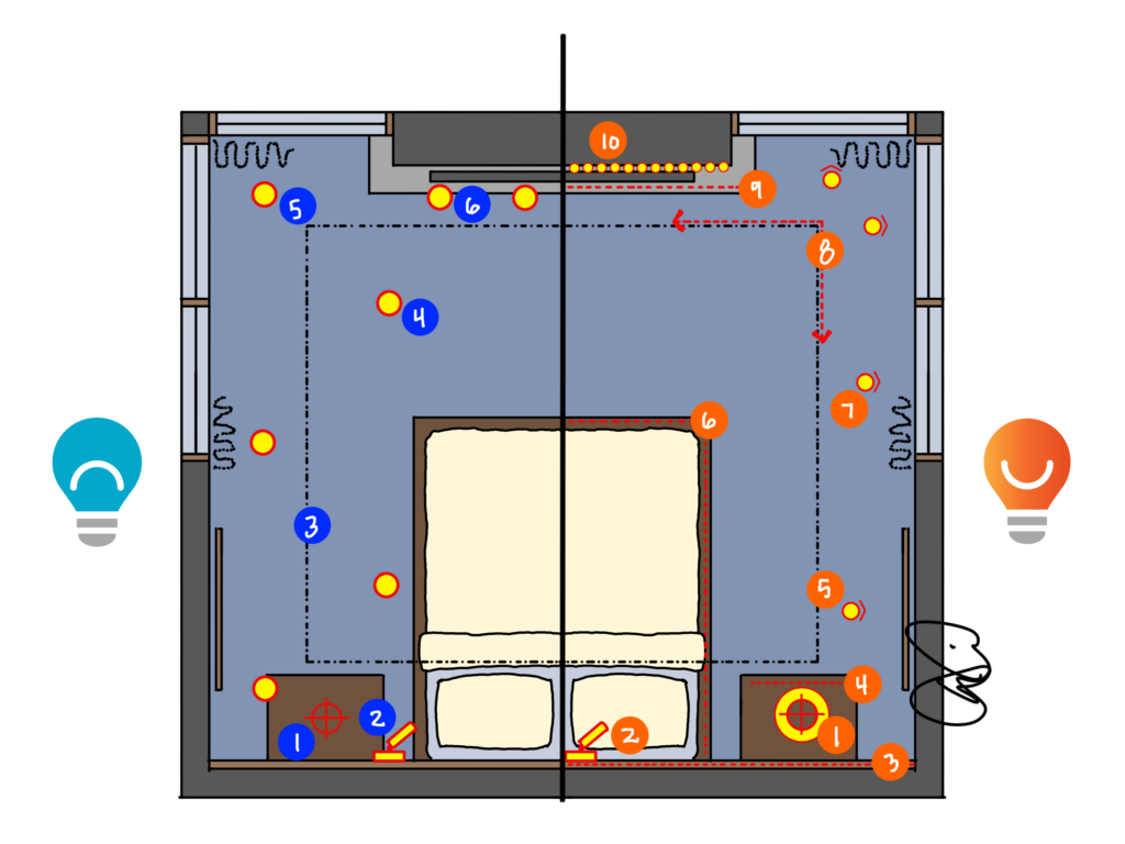
It’s all here in plan view:
Keep it dark. Curtains block out light pollution and trespass to help you get better sleep.
Light the walls. DO #3 lights the architectural reveal behind the bed, DO #5 accents artwork on the wall, DO #7 adds soft light to the closed curtains, and DO #10 grazes down the stone fireplace.
Glow the ceiling. The bedside lamp shown in DO#1 will shine light on the ceiling, as will DO #3 and the cove in DO #8.
Watch your step. Light below the bedside table in DO #4, below the bed in DO #6, and below the hearth in DO #9 all provide glare-free light where you need it most.
Respect your partner. Center-mounted reading lights in DO #2 point away from your partner, which means you may get to read another chapter before they mumble “are you done yet?”
Ditch the downlights. There are recessed adjustable downlights in DO #5 and #7, but instead of lighting the floor and adding glare, they are aimed at artwork and curtains, indirectly bouncing soft light into the room.
Point it away. Too many light sources on the DON’T side point directly downwards and will cause glare. The only light on the DO side pointed directly at the bed is the reading spotlight.
Keep it soft. Soft shades on bedside pendants, soft glows from indirect sources, and soft glows off the curtains keep the room as comfortable as a down duvet on a cold winter’s night.
Well, thanks for bearing with me. I’m going to publish this post as an “extra,” like when a store has too many leftover small items and decides to make them “free with your purchase today.” Fewer people will complain about the post if it’s free, right?
Read more of my DON’T/DO THIS posts HERE.
