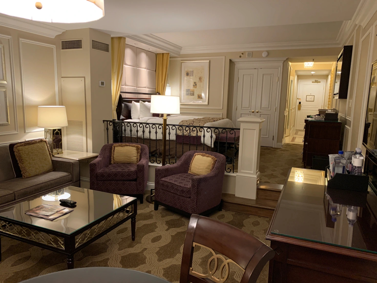
Awhile back I posted a Lightseeing piece when I attended a conference at the Venetian in Las Vegas. Sometimes conferences take places at hotels that have pretty scruffy rooms. This was not one of those conferences. Every room at the Venetian is a suite; the one above was mine. I counted over twenty light sources in the room. I get builders who regularly look at plans and say “that’s too many lights.” They could never stomach building something like this.
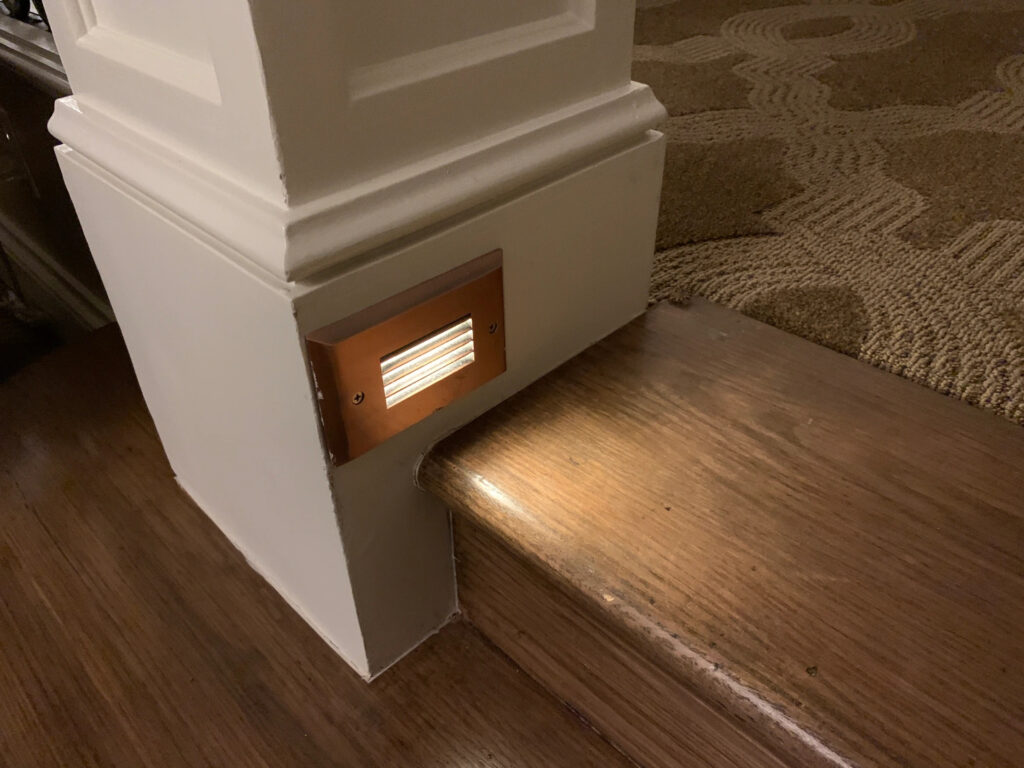
Watch your step! Softly glowing all night, this steplight kept me safe in case I desperately needed something from the mini-bar and had already turned off the other 19 lights.
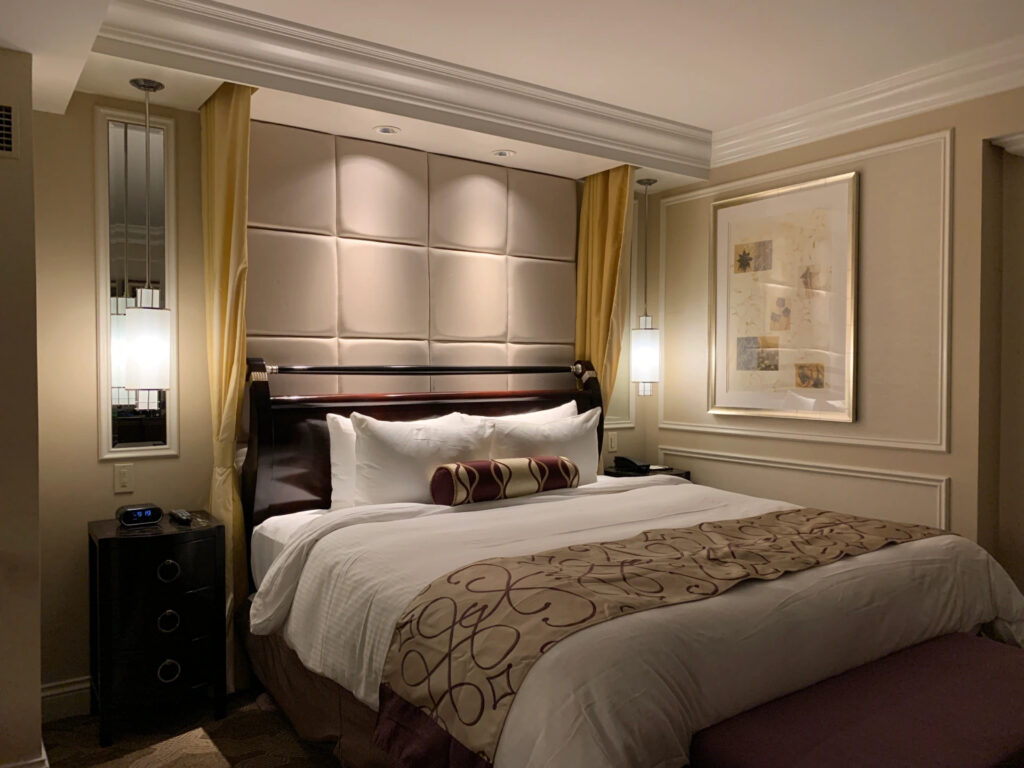
The bed was comfortably illuminated by recessed downlights and two bedside pendants, a technique now popular in residential design. The mirrors behind the pendants reflect the light and increase the eye-pleasing impact.
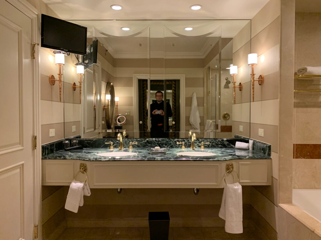
Ah, that’s me in the mirror taking a photo of the bathroom. There are so many luxury baths lit this way: a recessed downlight directly above the sink bowl and wall sconces for vanity lighting.
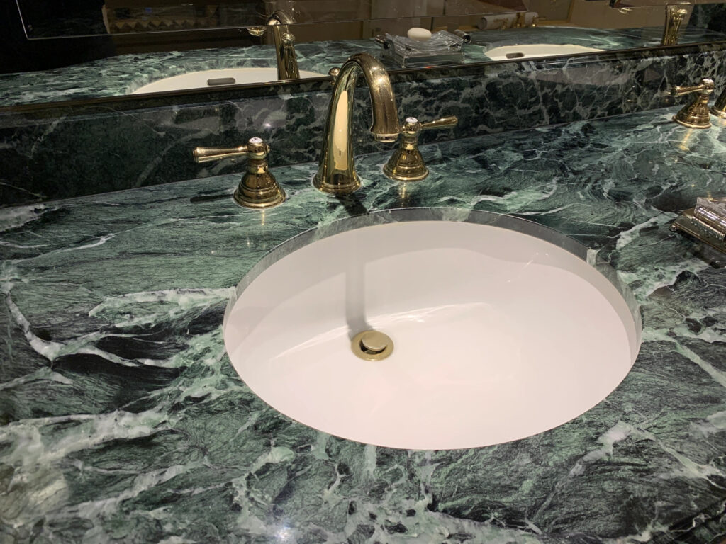
The downlights do a fantastic job of making the marble and brass look good…
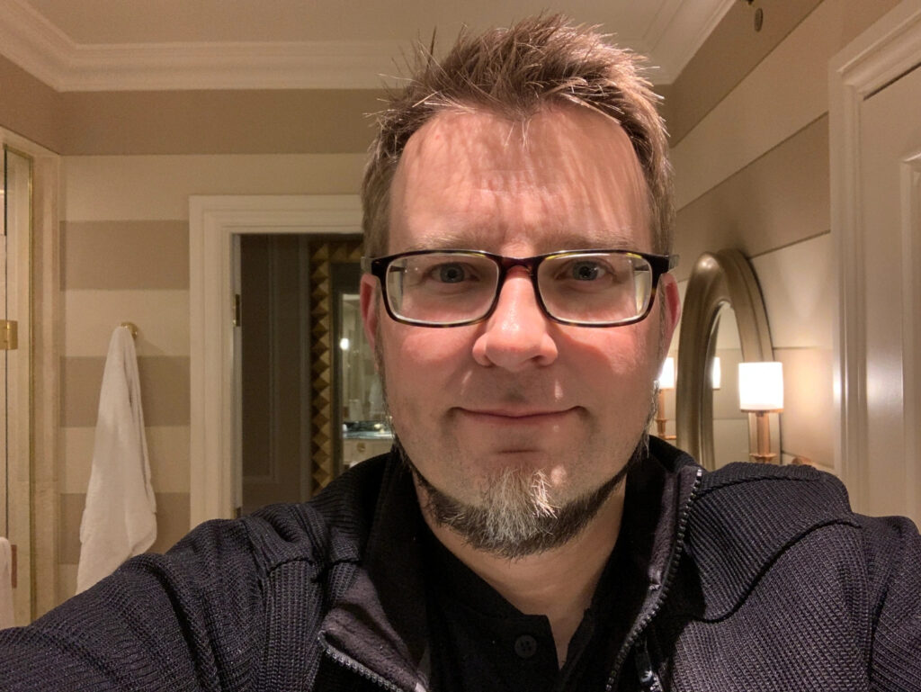
…but do a horrible job of illuminating my face. The deep shadows and high contrast make it harder to shave. I am glad I don’t have to put on makeup. This is an example of lighting for show that doesn’t work so well for us. It’s why my team and I are constantly looking for better ways.
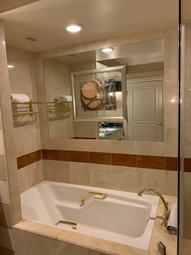
Ah…a nice relaxing soaking tub with a glare-bomb above. No dimmer, of course, so you’re either in the dark or getting a headache. Maybe that’s intentional- it’s hard to clean a tub. But I see this in houseplans all the time. It works for washing the dog but is as relaxing as an interrogation.
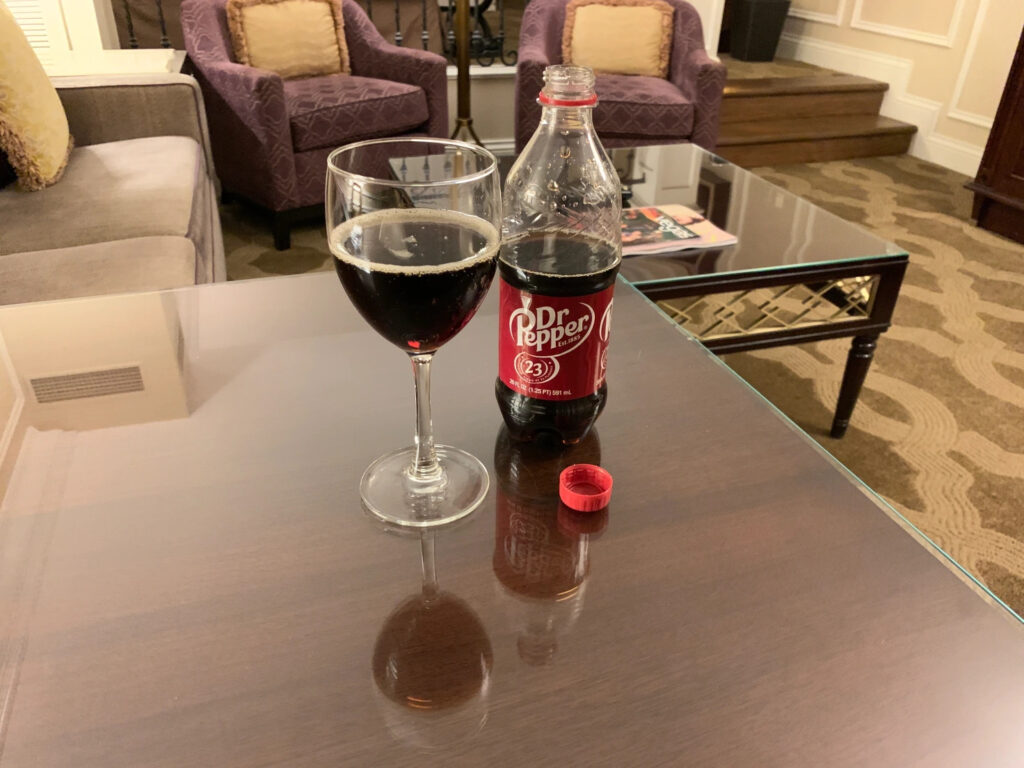
Some good, some bad…but the room served its purpose quite well, despite being twenty years old. I partied pretty hard in there as I finished up my presentations. What happens in Vegas….
