I confess that sketching for the Don’t/Do This series is as fun as it is challenging. While this series allows me much greater freedom than last year’s 1THING series, that freedom comes packaged with a desire to “say it all” in a single room, a single sketch, or a single post.
And if I know anything about lighting design, is that one size most definitely does not fit all.
So this week, as I explore the do’s and don’ts of a living room or great room, please remember that what you see here is a collection of our most frequent problems and solutions and by no means a comprehensive list. In fact, there is no such thing as a complete list, as we make new discoveries and try new ideas every week.
I get to make up the room by combining elements from a great many projects; this is not a real project but rather the amalgamation of many real projects. One recent project had the small square windows at the clerestory level. Another had bookcases with curved reveals. Another had a large iron chandelier. Another had beams on a sloped roof. The overall style leans traditional, simply because it is much easier to recognize the traditional forms of architecture for most of us. Perhaps in the next post I could do two sketches, one more modern. Hmm…now I see how this could be a full time job!

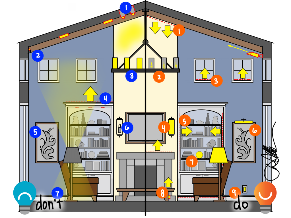
Let’s start with a section view of this living/great room. What are the Don’ts we see all too often on electrical plans?
- Eyeball floods on tall fireplaces. The concept is good- putting light on the central feature of a room- but too often the implementation is lacking. Many recessed lights are soft floods that create more of a “blob” of light up near the ceiling instead of pushing light downwards. This makes the very top of the chimney the brightest part of the feature. Sadly, that is where our eyes are least comfortable.
- Tight coves and drywall. This cove is also a good thought, but incomplete. It is too close to the ceiling, trapping light in a tiny pocket that then raises the contrast ratio and lowers the comfort. Coves need to be deep enough to spread light outwards onto the ceiling, the taller/wider the room the larger the cove should be. If the ceiling is sheetrock/drywall/painted white, and the cove light is between each beam, we have effectively illuminated the cheapest thing in the room and left the more beautiful features, like the beams, in the dark.
- Bright Chandeliers. This one is so common that it should probably be a House Rule: decorative fixtures up near the ceiling should never be on unless dimmed to 10%. Or perhaps 5%. The point is that, no matter how lovely, if a chandelier like the one shown above is on at full brightness at night, it will effectively make the seating area feel darker or cloudier. Too much light on the ceiling and not enough below simply leaves us lacking. And bright chandeliers can also add glare to a space that diminishes our comfort.
- More Drywall. Placing light on top of the bookcase as shown here can add a nice glow to the ceiling, but if it is placed too close to the wall or is too bright, this approach can have the result of focusing our attention not on the built-in but on the cheap drywall and paint above.
- Dark Arts. Too many living spaces are illuminated with a decorative fixture and downlights that illuminate the ceiling and the floor while leaving the walls the darkest surface of the room. This is exactly the opposite of what will make us feel comfortable – the walls should be the brightest, the floors second, and the ceiling third. Our eyes want light ahead of us, on the walls, and that also makes our art, photographs, finishes, and more look their best.
- Brass & Glass. Wall sconces flanking art above a fireplace go back to gaslight and even candles, and in the abstract can be a lovely feature in a space. But visible bare bulbs, behind clear glass or no glass at all, quickly become eyesores and glare bombs when used at full brightness. Already have these fixtures installed? Make sure you never need them on at more than 5-10%.
- No Sunset. In this example, disk/wafer/canless lights will illuminate the air far above our heads well but leave the floor dismally lit. Better performance recessed lights could push light to the floor, but after sunset this light can be a source of glare and potential sleep disruption. This living space needs light down low, down below our eyes, so we can navigate comfortably at night with minimal glare and discomfort. Think garden path lighting; just enough.
I suspect you already know the antidotes to the different maladies described above – it is so often simply the opposite that is needed. I can confidently say that most lighting in most homes is exactly the wrong light in the wrong place doing the wrong thing. So the Do’s of living room light are easy to understand once you are familiar with the Don’ts.
- Grazing Fireplaces. Anytime you want to illuminate something that is very tall, like the fireplace shown in this illustration, your goal should be to push light over as much of the surface as possible. When the surface is textured, like a fireplace with stone or tile, grazing can be a fantastic choice. Generally speaking, grazing means pushing light across the surface of a feature, closely skimming the stone or tile or texture so that detail is revealed. Special fixtures are needed to make this happen – either linear fixtures with grazing optical lenses or performance recessed downlights with adjustable aim.
- Glowing Decoratives. Decorative fixtures can be a beautiful and important addition to a space. They can add sparkle, especially when a room is dimmed, and provide a psychological boost that lifts our mood and appreciation of the space. Without these fixtures, we may feel like our home is cloudy. With them, when dimmed properly, we may feel more comfortable and relaxed.
- Daylight Replacement. Windows turn into black mirrors after the sun goes down, subconsciously introducing discomfort and unbalancing the light in a space. Special features, like adding light to the sills of these clerestory windows, can gently replace some of the light lost after sunset. Guests may not even notice these lights, but they will feel the effects. One homeowner, after we illuminated windows just like this, later described them as her favorite light in the entire home.
- Soft Sconces. I’m a big fan of decorative fixtures…when the bulb is concealed by a soft frosted glass or fabric shade. Soft light is more comfortable than the glare of a visible bulb. On the fireplace, flanking patio doors, or on window walls are all great places for sconces.
- Illuminated Shelves. When we hear “indirect lighting,” we are usually thinking about light bouncing off the ceiling. There are many other ways to get indirect light into a room, like illuminating bookshelves with vertical linear LED strips. The resulting light helps you see what is on the bookshelves, but how often is that necessary? Every evening, however, that same light will bounce gently off the books and collections and filter into the room, increasing the available light while minimizing glare- and that is what comfort is all about.
- Art. Illuminating art, from a picture light or adjustable spotlight, is another way of getting indirect light into the room by bouncing it off something lovely. The benefits, just like illuminated shelves, are twofold: you can see and enjoy the art (or photography, or stone, or wall covering) and you get soft, indirect light into the room itself. Light on walls, like soft wall sconces, also feels great while satisfying our psychological need for brightness and our physiological need for glare-free illumination.
- Glowing Lamps. What can you do when there is nowhere for art lighting or soft wall sconces? Consider adding an accent lamp to your shelves or mantel. Accent lamps are really anything that glows – think a group of candles, a Tiffany stained glass lamp, an illuminated sculpture, or more. I like to repurpose old light fixtures to this end, or have my woodworking son build something unique.
- Fireplace Features. Most photos of a lovely home will have a fire going in the fireplace, regardless of the time of year. We have a primal, visceral reaction to a contained, controlled fire- so much so many of us pump gas into our homes to make it easier to enjoy the flicker and visual warmth of dancing flames. But much of the year, that lovely source of light becomes a black hole- and an opportunity for creative lighting. Lighting a mantel, uplighting the stone or tile around the fireplace, and illuminating under the hearth are all ways to highlight the fireplace and provide some of the warm glow you would get from burning wood.
- Path Light. We need light to see where we are going, but late at night light from above our heads can be disruptive to our sleep cycles. Light down low – like in toe kicks or from shielded step lights – can be a beautiful, comfortable way to move through the safely while minimizing sleep disruption. A few years ago I helped a friend with some lighting upgrades; they later reported that the step lights were their favorite lights!

Whew. That was a long list. I’ll keep thinking on how I can make this more approachable…but for now, let’s look at a few more do’s and don’ts in plan view.
DON’T
- Puck lights in shelves. Puck lights were a wonderful tool while back. Then again, so were compact fluorescent bulbs. We no longer use compact fluorescents (thank goodness), so why are puck lights still in use? Yes, there are a few occasions where puck lights can be useful. But in most cases, like at the top of bookshelves, they will at best provide uneven light and at worst add glare directly into the eyes of someone seated in the space. Linear light running vertically will provide much better light.
- Disk or Downlight Grids. As you can see from the sketch above, I do sometimes recommend a grid of recessed downlights in living areas, especially when the ceiling is high. But these should be adjustable fixtures with deep recesses to minimize glare – most certainly not disk or wafer lights.And be conscious of the grid- in the Don’t above, there is a light that will cause ugly glare on the fireplace that could be omitted or repositioned for better results.
- No Lamps. Lamps, like table lamps and floor lamps, are really the only way to get good reading light into a living room. Yes, we can push enough light from the ceiling for reading, but it won’t be as comfortable as light from just over your shoulder. Lamps also provide soft illumination to the floor, some on the ceiling, and a glow on our companions’ faces that makes conversation easier. I know that they don’t look great in photos because they block the architecture, but sometimes we have to sacrifice a little glamour to gain a lot of comfort, like trading high heels for flats.
- Drywall. I mentioned this above, but anytime you add accent lighting like to a cove, make sure you know what you are illuminating and what you are leaving dark. In this case, light is placed on ceiling drywall (most often the cheapest and least lovely surface in a room) and not on the beams. This will make the beams harder to see, as will bright downlights that shine in your eyes.
- Dark Shades. Black or metal lamp shades can be quite fashionable and dramatic, but for reading, seeing faces, and feeling comfortable, they are seldom the right choice as they create harsh shadows and leave much of the space dark.
Avoiding bad lighting is the first step to a more comfortable, relaxing, functional, and enjoyable home. Adding good lighting is the second step. Here are a few suggestions for living rooms shown in the plan sketch above.
- Fireplace. In this example, I placed a recessed adjustable downlight at the corner of the fireplace to graze down the stone. You’ll also see a small uplight shining up on the fireplace surround for detail.
- Lamps. You need them for reading and for seeing the faces of loved ones comfortably, and for visual comfort and warmth. Even if you do not read or use a tablet, table and floor lamps are a must for comfort.
- Adjustables. It is not uncommon for us to use two hundred recessed lights in a luxury home. Of those two hundred, perhaps six are true downlights (in the showers for wet rating). The other one hundred and ninety-four fixtures are likely to be recessed adjustable, fixtures that allow aiming at walls, art, and features. In a living area, these can be adjusted to provide good light on a coffee table or sofa instead of indiscriminately lighting the entire room. This is pretty basic lighting design theory: put light where you want it. Without adjustability, you’re lighting the space like a gas station canopy at the pumps.
- Linen Lamp Shades. Those lamps mentioned above need soft fabric, acrylic, or glass shades that transmit light out sideways, not just up and down. That soft light feels comfortable, like a sunset, while adding great light to faces.
- Ceiling Features. Why spend money on ceiling beams, heavy timber trusses, or detailed ceiling coffers if you are just going to add downlights that make them harder to enjoy? Consider adding light to these ceiling features, like the spotlights shown here that illuminate the underside of each beam. This will help the space look better – and also add soft indirect light to the room.

Oof. This is becoming a chapter, not a blog post. Better pour another cup of coffee.
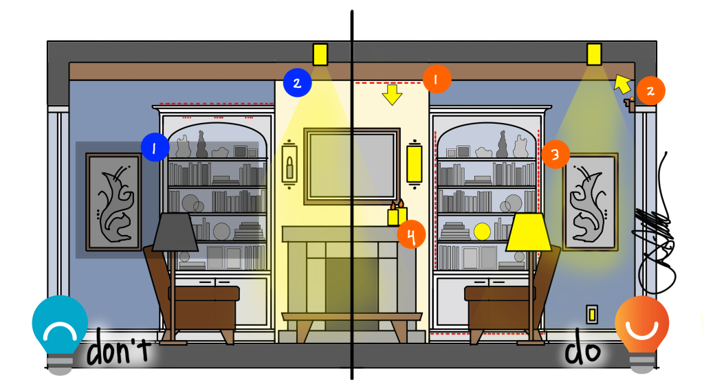
“But wait, David, I don’t have a double-height great room. What should I do?”
So glad you asked. Living rooms with lower ceilings are actually my personal preference (I love changes in ceiling heights, but some great rooms feel more like airport terminals than homes), and lighting does not need to be sacrificed just because you lack a cathedral ceiling.
Here are a few Don’ts for lower ceiling spaces:
- Dark Walls. Just like in tall ceiling spaces, don’t leave walls, shelves, art, and vertical surfaces dark. The lower ceiling will allow you to illuminate art from the ceiling (DO 3), which is quite difficult from tall ceilings. All of the solutions above apply – picture lights, shelf lighting, accent lamps, and illuminated features like stone.
- Downlights in the Wrong Places. This downlight could be shining on the television screen, if that is a tv above the fireplace. That will make it harder to see the screen, potentially adding eyestrain to your viewing time. Skip it, and look for ways like grazing (DO 1) that shine line behind the screen instead.
Do this:
- Stone Grazing. Grazing the fireplace is a great way to feature a fireplace, minimize glare, and add indirect light to a room.
- Indirect Light. While lighting each beam might be lovelier, dropping a cove down from the ceiling can add soft light to a room. Be careful to not use it overly bright, as that could make the room feel cloudy and dark.
- Art Light. Recessed adjustable fixtures, as mentioned above, are my go-to in almost every room of the house. When located properly, they can expertly illuminate art with minimal glare.
- Candles. There is a reason candles are a billion-dollar industry. We love the warm flicker of natural flame, so if you are really looking to relax, don’t overlook candles. They have the added advantage of being wire-free and cheap to install. Be careful, of course, with open flame!
Congratulations. You made it. If you have any suggestions for how to simplify this, do share….
Read more DON’T/DO THIS posts here, added monthly in 2023.
