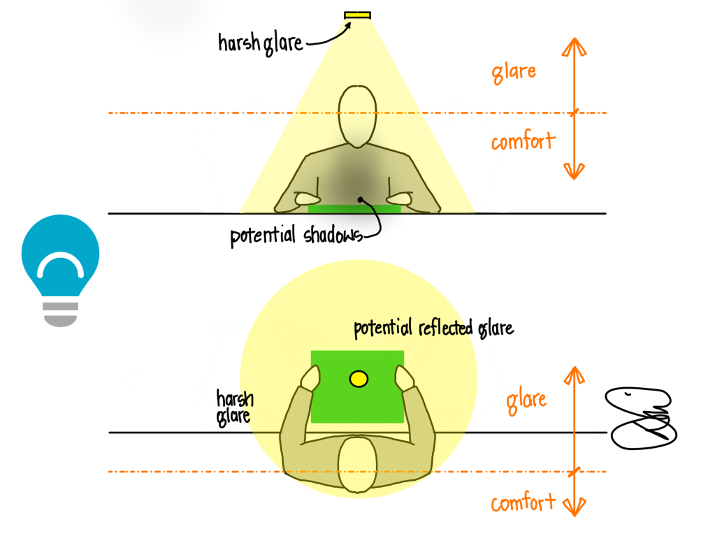
Of all five (or six?) of the promises of light, light that helps us Do Better is the one most of us think we know. It doesn’t take a lighting designer to understand that, if we want to read a magazine, we need a light on it. Does it really matter if it comes from a table lamp, a book light, a recessed light, or sunshine? If there is a lovely downlight over the magazine, as in the sketch above, why did I put a sad bulb on the graphic?
The previous post elaborated on the idea that light for our hands can help us see what we are doing so we can do it better. But, like so many aspects of our built environment, the equation must include both quantity and quality. We must factor in the light source and its color quality, but also where it is and how it is delivered to the task. When I stop to think about these questions, which is perhaps the main point of blogging, I sometimes surprise myself and even change the way I think.
A single downlight over a table or couch might provide enough light, in a purely mathematical sense. You will have enough footcandles or lux, when measured by a light meter, but something will be not quite right. If you lean in over the page to study a photograph, you may shadow the very page you are attempting to see. If you are looking at a glossy brochure or magazine, you may see a reflection of the light source in the page, further obscuring the subject. And given the geometry of the human eye, we will also have placed a light fixture in the most offensive part of our retina, a glare zone that causes eyestrain and fatigue even when we do not consciously notice.
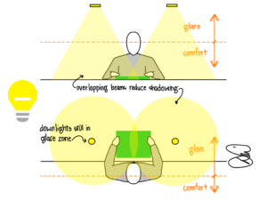
Clients will frequently as “do we need this many lights?” It is a fair question, given that I will almost always use twice as many fixtures as a typical layout. The question needs a bit of developing, of course. Does the client mean “do we need this many lights to deliver 400 lux on an unobstructed task plane” or “do we need this many lights to help me read comfortably?” The answer to the first is no, we can satisfy a light meter with one fixture. But we cannot satisfy a human in the same fashion.
In the illustration above, two fixtures are used instead of one, allowing overlapping beams to help mitigate shadowing on the magazine or work. This reduces the amount of glare, but the fixtures are still in the glare zone of the eye and will not be comfortable for extended periods of time.
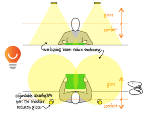
Nudging the fixtures behind the shoulders of the individual and aiming them back at the work surface can trim down a bit of the glare. This must be done carefully to minimize shadows from our bodies, but can be much more comfortable. This is how I like to approach lighting a bathtub that is used for soaking and reading; the light is safely away from the water and over the shoulder, reducing harmful glare. This geometry works so long as the person will sit in only one place (like a tub), but anywhere there is flexibility this idea can break down.
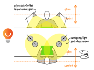
An even better approach is to bring the light source down below our eye level. In this case, shielded desk lamps push useable light to the page allowing the reader to comfortably see what they hold in their hands. Overlapping beams reduce shadows, and the flexibility of lamps makes for easy adjustment as tasks, needs, or users change.
The examples here are not to say that two desk lamps with good shades are the best way to provide task light to help us do better, but simply one way. The key is to think about the light source in relation to our eyes. Keep it behind or below your eyes. Overlap the beams to counteract shadowing. That’s it, really.
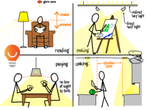
We do not always have the luxury of using a pair of desk lamps; in some places it simply is not practical or functional. The kitchen counter needs to remain free of obstructions, though I have seen folks use lamps when no other option is available. Floor lamps can be behind our eyes, just over our shoulders, and the shades can shield the bulbs from our direct view.
Playing a game requires light on the cards; a pendant over the table can be hung so as to not obstruct our view of each other but to block our view of the bulb itself. And artists and craftspeople need good light that won’t get in their way, and that usually means from above. Bouncing light off the ceiling can help diffuse shadows, and strong light from either side can push light where needed most.
Light for our hands can help us see what we are doing so we can do it better…if we keep it behind or below our eyes and overlap the beams to counteract shadowing. Within that short rule set, the possibilities are endless, and that’s what makes my job fun. Just don’t fall into the trap of thinking this light will be all you need; we still have four or five more promises to deliver.
Read more of my Light Can Help Us series HERE.
