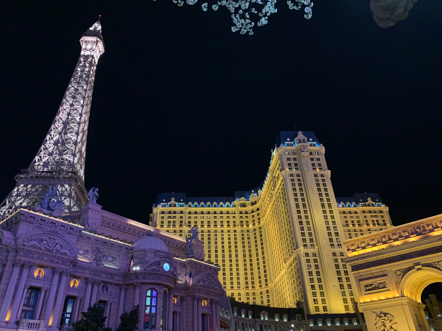
Las Vegas is not the city of light, it is the city of lighting. Electric lighting. Lots and lots of electric lighting. And since Vegas is all about nightlife and casinos-without-windows, it is impossible to see anything in Las Vegas without Lightseeing. I was there with the team a few weeks ago for a conference, which translates into four days of total lack of sunshine.
But it was bright anyway.
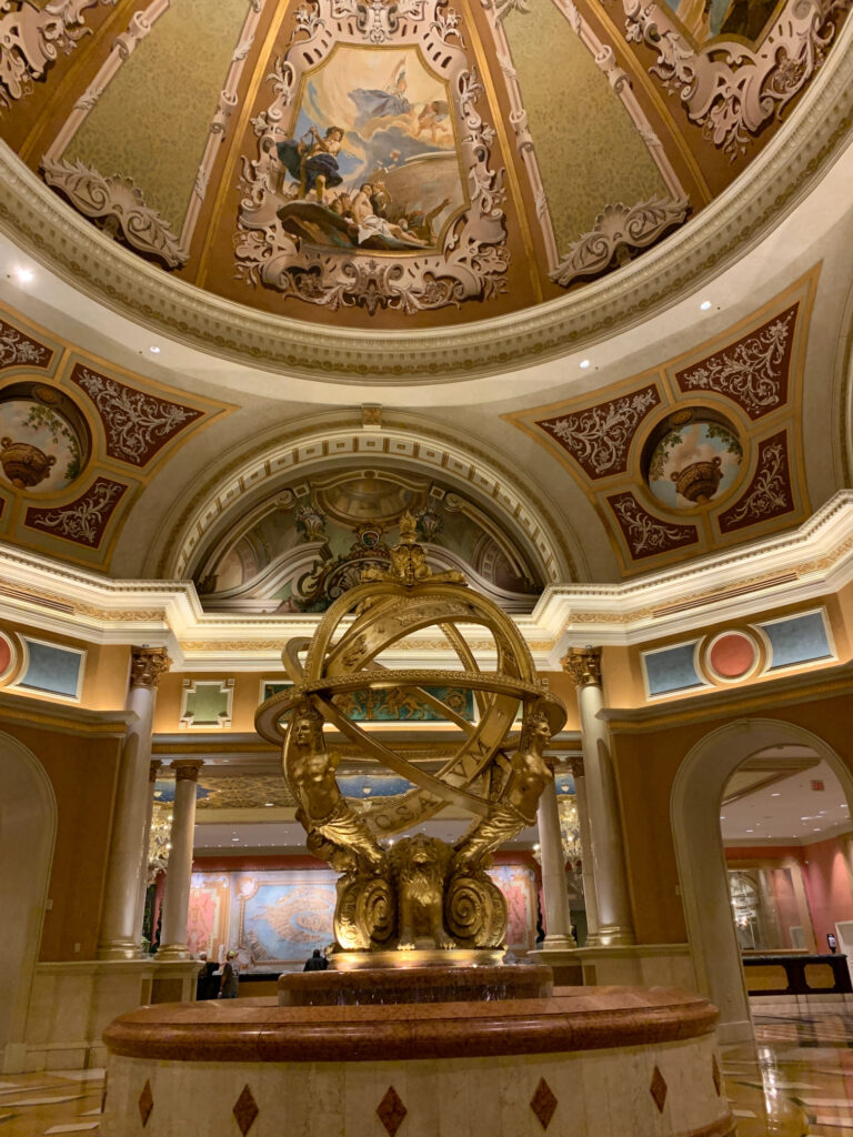
The conference was at the Venetian/Palazzo, once the largest hotel in the world (now in second place). It’s like Disneyland bought Venice and turned it into a casino. The hotel lobby, above, is like a cathedral, a temple to opulence. There are lights in the floor, lights in the ceiling, lights in the coves, lights in the other coves, and lights in the other coves. Their are at least four layers of light dedicated to the ceiling alone.
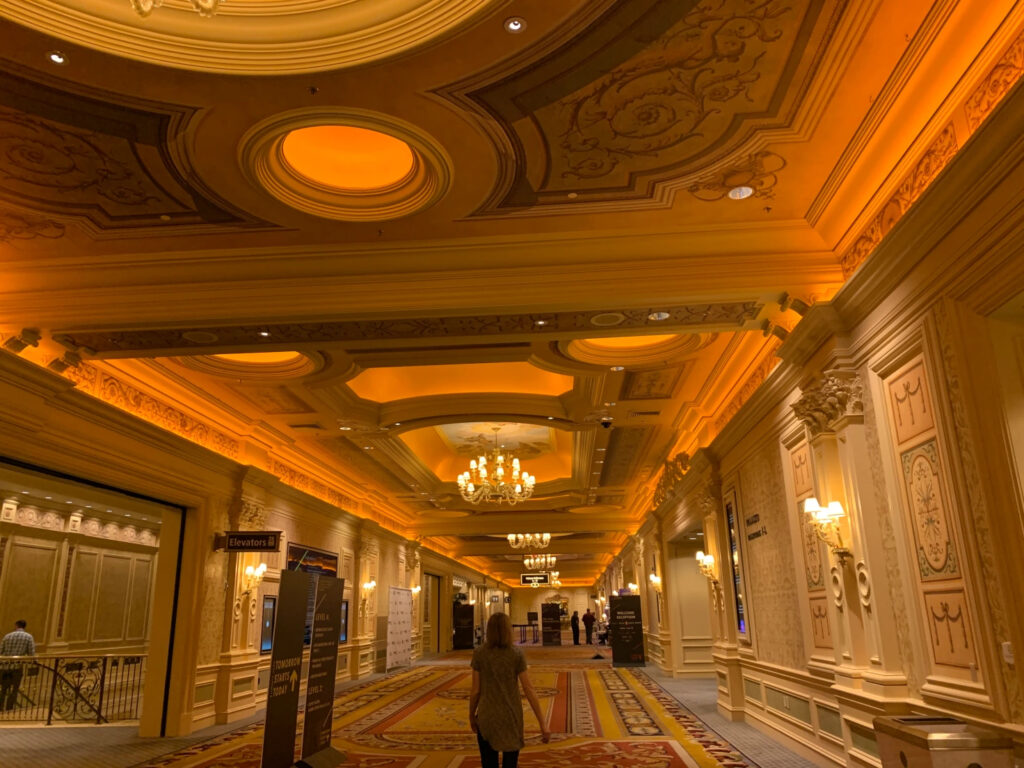
The opulence continues throughout. This is how they treat hallways at the conference center. The extraordinarily warm light in the various ceiling coves and coffers felt very “golden” and luxurious, but it also appeared a bit orange to my eyes. Note the layers of recessed downlights, chandeliers, and wall sconces that add in for a complete look. Remember, this is a hallway!
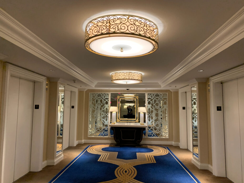
Okay, so not all hallways are that luxurious. Here is the elevator lobby on my floor. There are recessed downlights above each elevator door illuminating the threshold and floor for a feeling of safety. There are table lamps on the ubiquitous credenza (what are those tables really for??). And the flush-mounted drums above do a very nice job of providing soft illumination throughout while adding a bit of glitz and glamour. Because this is Vegas, this hotel lobby is dated and not as luxurious as it could be. The Venetian is, after all, twenty years old. How was the hotel room? That will be a post of its own….
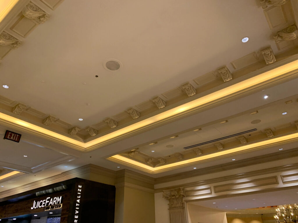
Here’s an interesting technique I look forward to trying in residential- a traditional cove with an inner ring of decorative molding that stops the light from spreading evenly across the ceiling. The result is a wide soft line of light and an intriguing sense of depth. In the lower right corner of the photo you can also see one of my least favorite techniques: the oops-there-is-an-ugly-scallop-of-light technique. I wish I could say I’ve never made that mistake.
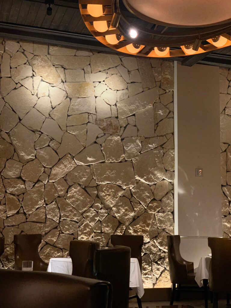
I dined at Emeril’s Delmonico’s. This is not a fast-food or quick-service restaurant but rather the kind of establishment that serves $100 meals. The food was excellent. The lighting concept was good…but somehow over the years it ended up being what you see above. The light grazing up the stone is dramatic…but what is the idea between the two spotlights hitting the top of the stone? And why is there a spotlight shining in my eyes as I sit at the table? Not everything in Vegas is great.
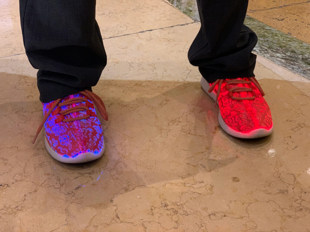
Okay, a few fun ones to finish up. These are Kate’s shoes, which she custom-painted orange to match our corporate identity. Kate is a designer…can you tell? Yes, they change color. Yes, she can make them flash. Yes, they are USB-rechargeable. Who knew?
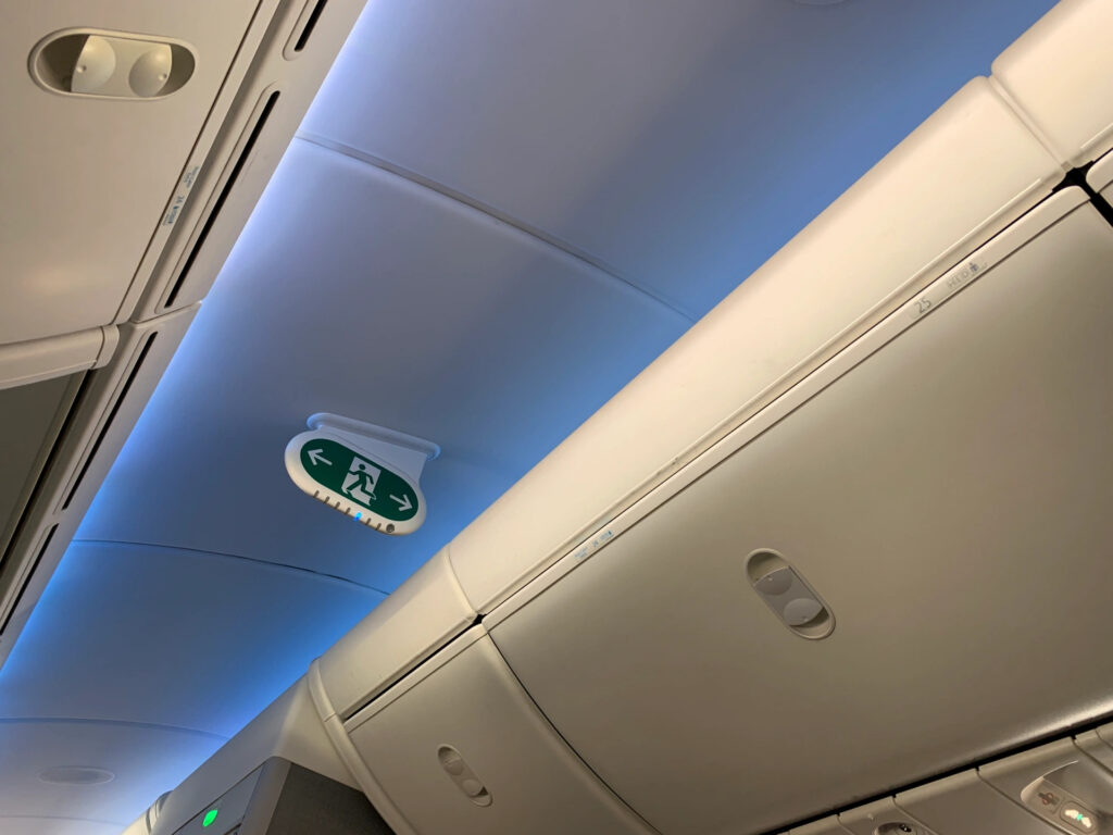
Finally, on the Boeing Dreamliner that carried me across the country, I noticed something I had not before. The blue light above is obvious…less so is the narrow, soft band of white light coming from hidden sources that illuminates the seat numbers and overhead bins. That’s design…invisible, functional, and beautiful at the same time. Who knew even airplanes would have layers of light!
