I am continually amazed at the lack of color in our lighting, at home and at work. We wear colored clothing, drive colored cars, paint our homes and cabinets in color, and hang colored photos and art on our walls. We choose colored carpets and colored ceramic tile, we buy colored backpacks and purses, some of us color our hair. We can even choose colored computers and colored computer desktop images to stare at all day. Color is everywhere, it seems, but in our light.
As with many of my THINK LIGHT posts, I began today’s writing with an idea that morphed into something else by the time I was finished. I thought I was going to talk about color temperature (again), but as I sketched and mused I realized that I was building a case for color in light. This is not a new idea. I have posted about color temperature and variable white light and many other facets of this discussion, and the internet is full of other posts about light and color. So why write again?
My ongoing quest is to simplify the language of light, to make the science and technology and art of light accessible by talking about light in a new way. This is a bit of a pioneering effort, an ongoing journey towards a deeper understanding of light, and that means a blog post two years ago might not reflect how I think – and more importantly, speak – about light today. So I write again.
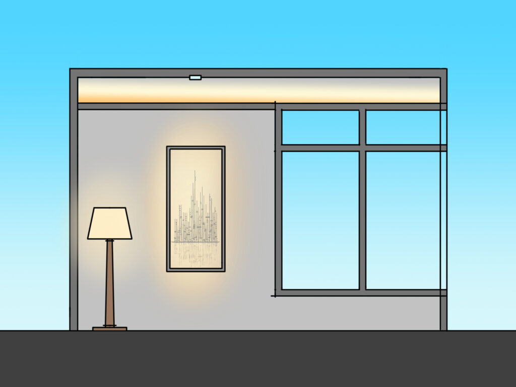
Today I address those who say to me “I don’t want that yellow light.” There are scientific reasons, good verbal justifications, and charts that point to an answer, but this post will be a little more about pictures than words. I hear this comment occasionally and my first impulse is to label the individual as uninformed and to patronizingly explain how white light is relative.
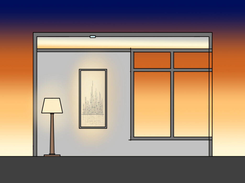
But the truth is, I don’t like yellow light either…in the middle of the daytime. As the image above shows, warm colored light (such as 2700°K or 3000°K) can look very yellow when surrounded by the crisp cool whites of daylight. The above sketch would look a little better if the light inside the home was not so…yellow.
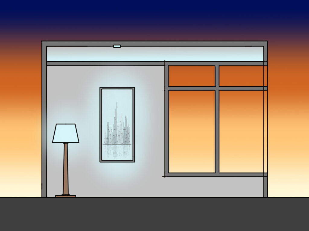
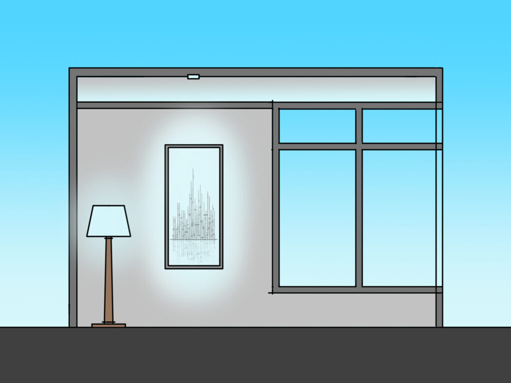
Today I also address those who say to me “I don’t want that blue light.” Certain fluorescent and early LED light sources favored cool blue-ish light (4000°K or 5000°K). When the sun is setting outside or night has begun, these lights can look very blue and be associated with negative words like sterile or institutional. At night, I don’t want that blue light either. It simply does not feel right.
Bright blue light at night does not feel right to us because our bodies are programmed to prefer the warmth of the setting sun or campfire as we move towards rest. A few images ago I showed how “yellow” light is just plain wrong in the daytime, but the sketch above shows the same warm lights in a new context, a different time of day.
In this case, I very much do want “that yellow light.”
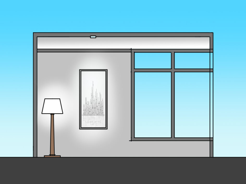
And during the day? I very much do want “that blue light” that I avoid in the evening hours. This gets a bit trickier to sketch, as the image above shows. There is something very unnatural about “blue” light in photos and sketches because our eyes do not have the freedom to “white balance” light. If, for example, I used cool 5000°K light in my home during the day, my eyes won’t see blue light. It will look more like this:
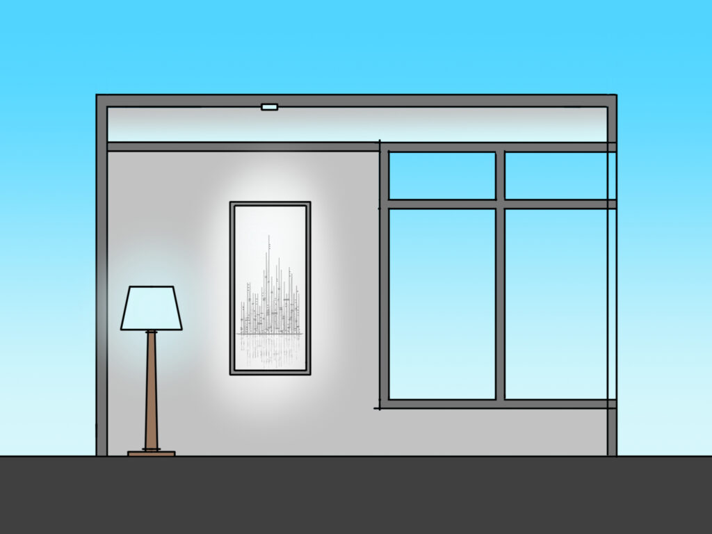
Ah, you say, there is what I want – white light. Of course, in reality, this is the same light that would “that blue light” you do not like at night.
Hmm…I’m confusing myself. All this talk of blue and yellow and white light seems to be circular…because it is. I don’t want yellow light during the day, I do want yellow light at night. I don’t want blue light at night, I do want blue light during the day.
And I always want my light to look white.
That’s the real trick. To make light look white, I need that yellow light, I need that blue light, just at different times of the day. The only way to get there is to have light that changes color.
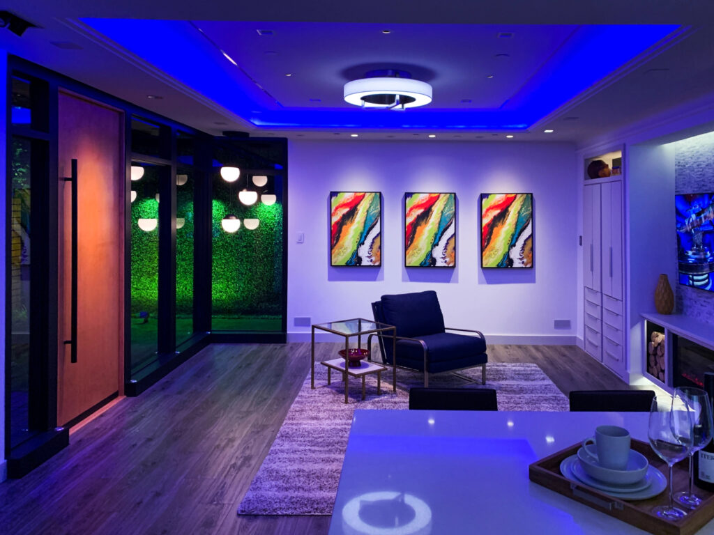
And once I have light that changes color, I can use it as a tool to enhance the indoor environment.
I can use color to make a piece of art stand out from the background.
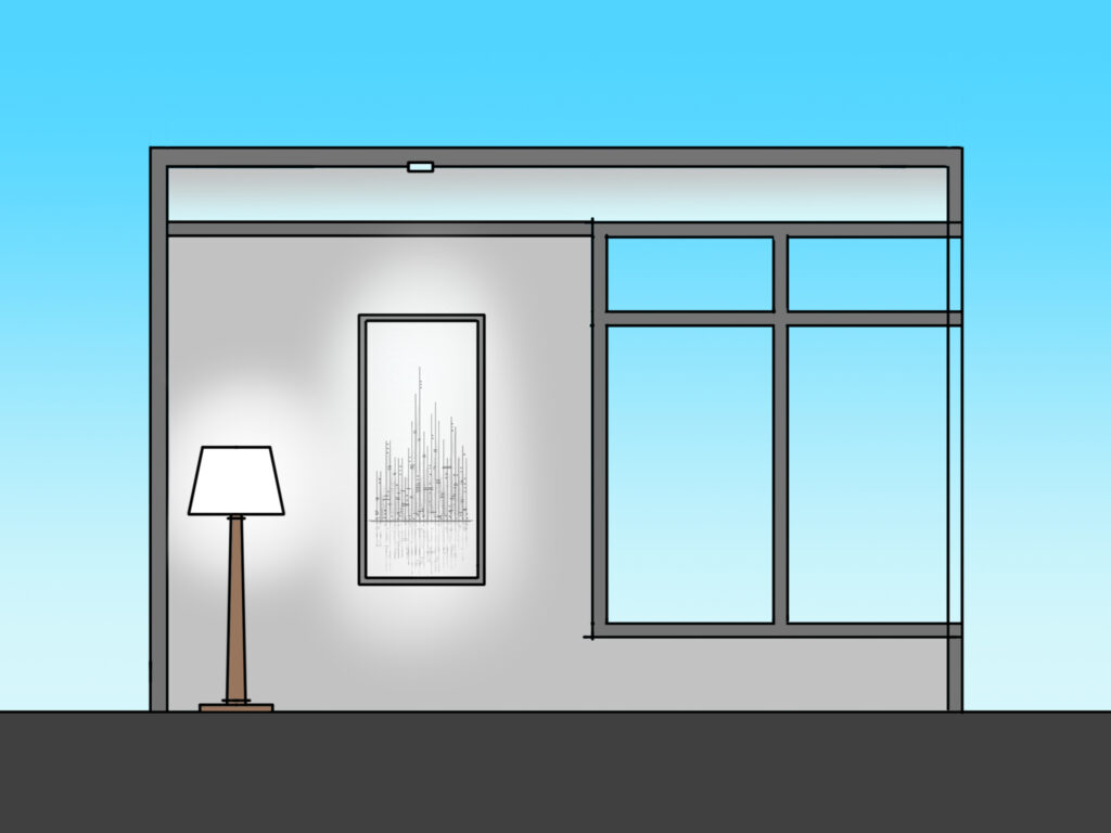
I can use color to make the room look white and my ceiling look like the sky.
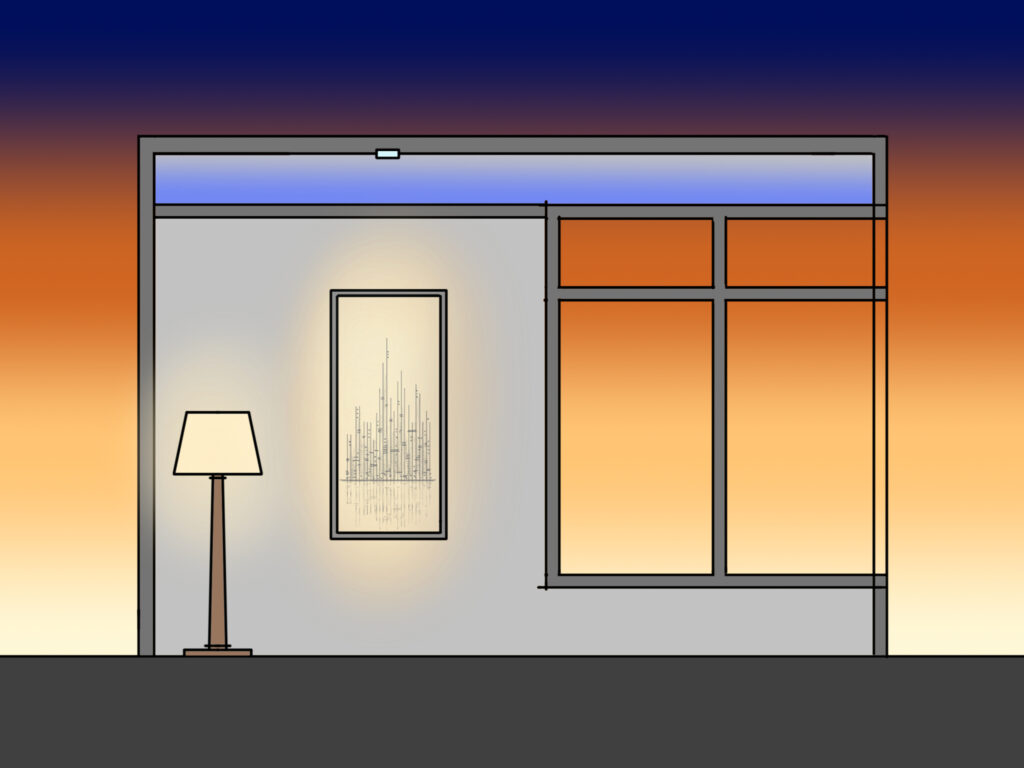
I can use color to make the room feel warm and the sky feel like night.
If I hear someone say “I don’t want that yellow kind of light,” I respond “neither do I.”
If I hear someone say “I don’t want that blue kind of light,” I respond “neither do I.”
And I know that those clients are the most likely to benefit from color-changing light.